Crafting a Storm Surge and Hurricane Risk Rating for Coastal Properties

Crafting a Storm Surge and Hurricane Risk Rating for Coastal Properties

In an era where climate change is intensifying the frequency and severity of storms and hurricanes, especially in coastal regions, understanding and quantifying the associated risks is critical.

According to the National Geographic Society, a storm surge is a rise in sea level that occurs during tropical cyclones, which are intense storms also known as typhoons or hurricanes.

The storms produce strong winds that push the water into shore which can lead to flooding and pose a real threat in coastal regions.

To help understand these risks, a Storm Surge and Hurricane Risk Rating score can provide property owners, developers, real estate agents, insurers, urban planners, local governments, buyers and investors with a clear picture of a property’s vulnerability to these natural disasters.

These stakeholders will be conducting their own necessary research, and a risk rating system can offer an indicative metric to guide their decisions.

Why is a Storm Surge and Hurricane Risk Rating Important?

Understanding storm surge and hurricane risks is crucial for building a resilient society.

Natural catastrophes pose significant challenges, and quantifying these risks can aid in better preparation and prompt responses.

Strengthening homes and incentivising homeowners to invest in property fortification can reduce potential losses. Accurate risk assessments and reliable data can allow insurers to offer discounts for mitigation actions, enhance home resale values, and reveal the increased costs to mortgage issuers due to natural disasters.

Achieving resilience relies on expert understanding of the real estate ecosystem and the benefits of informed mitigation strategies.

Steps to build a Storm Surge and Hurricane Risk Rating

1. Defining scoring criteria and scale

The foundation of a risk rating system is a clear and understandable scale, such as 1 to 10, with each number representing a different level of risk.

Establishing specific criteria for assessment is also essential for a well-rounded evaluation.

2. Key factors to consider

Several factors contribute significantly to a property’s risk from storm surges and hurricanes:
Proximity to coast


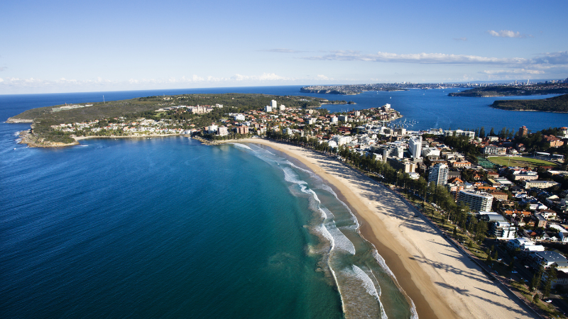
  • Proximity to Coastline: The closer a property is to the coastline, the higher the risk of storm surge impacts.
  • Elevation and Topography: Properties at higher elevations or with certain topographical features may have reduced risk.
  • Historical Data: Analysing past hurricane and storm surge incidents from historical weather databases and local government records can provide critical insights into potential future risks.
  • Local Climate Trends: Understanding the local weather patterns can help predict the likelihood of storms.
Natural barriers
  • Flood Zone Designation: Properties in designated flood zones face a heightened risk. Flood risk information is generally available from Local Councils.
  • Building Design and Materials: Construction that is designed to be resilient against high winds and flooding can mitigate risk.
  • Infrastructure and Preparedness: Robust local infrastructure and emergency plans can play a vital role in risk reduction.
  • Natural Barriers: The presence of natural features, such as dunes or wetlands that can absorb storm impacts, reduces risk.
  • Regional Planning: Effective community and regional planning and zoning can mitigate potential damage. Consult local zoning laws and development plans for more property-specific.

3. Assigning weights to each factor

Assigning appropriate weights to each of the above factors based on its impact on overall risk ensures that the score accurately reflects the property’s vulnerability.

Use expert consultations and statistical analysis to determine appropriate weights, and adjust weights based on real-world data and expert feedback.

4. Data collection and analysis

Gathering and analysing data, including GIS mapping, climate records and historical event data, is crucial to assigning accurate sub-scores for each criterion. Cross-referencing multiple sources will ensure data accuracy and statistical software can be used for thorough analysis.

5. Calculating the overall score

By aggregating these sub-scores, considering their respective weights, we arrive at a comprehensive risk rating for each property. Using a formula or algorithm will ensure consistency in calculations. Further validating the scoring system with sample properties will help improve accuracy.

6. Validation and adjustment

It’s vital to validate and adjust the rating system against historical data and expert analysis to ensure its reliability and accuracy. Regularly review and update the criteria and weights based on new data.

Checklist

7. Providing risk mitigation recommendations

Along with the risk score, offering advice on how to reduce a property’s vulnerability to storm surges and hurricanes can be highly beneficial. Suggestions such as upgrading building materials, improving drainage systems or investing in flood barriers can form a checklist of actionable steps to reduce a property’s vulnerability.

8. Regular updates and re-evaluations

Continuously updating the risk rating system to reflect environmental changes, infrastructure developments and updated data is crucial. This includes regular reviews, incorporating new data and tech advancements can improve the risk rating system. 

Building Resilience with Accurate Risk Ratings

Stakeholders can create a robust and reliable risk rating system that enhances safety and preparedness in coastal areas.

A well-developed Storm Surge and Hurricane Risk Rating can provide essential information for making educated decisions about property development, insurance and risk management.

As the world grapples with the increasing challenges of climate change, these tools become ever more critical in our collective efforts to build resilient communities.

Subscribe to our newsletter

Subscribe to receive the latest blogs and data listings direct to your inbox.

Read more blogs from The Proptech Cloud

Crafting a Storm Surge and Hurricane Risk Rating for Coastal Properties

A high-level approach to developing a storm surge and hurricane risk rating system to guide stakeholders with a vested interest in coastal properties.

How Proptech Is Revolutionising Real Estate

Proptech is the dynamic intersection of property and technology, and it’s reshaping real estate. And there’s still a huge potential for growth.

What is the Australian Statistical Geography Standard (ASGS)?

The ASGS is used to better understand where people live and how communities are formed.

How to Incorporate Mesh Blocks into Datasets

Mesh blocks can enhance the precision and relevance of geospatial and proptech analyses. Here are some tips and steps to incorporate mesh blocks into datasets.

Australia’s Migration Trends: Where Are People Moving To?

This detailed visual analysis for Australia’s major capital cities breaks down how net migration trends are evolving across different regions.

Australia’s Migration Trends: Where Are People Moving To?

Australia’s Migration Trends: Where Are People Moving To?

Data consultancy, Data Army, delved into the Australia Post Movers Statistics dataset to understand where people are migrating to within Australia and predicting where they’re likely to move to next.

We explain the data visualisations created and documented in our previous blog How to Predict Migration Patterns using Auspost Movers Statistics Data and Snowflake’s Cortex ML functions>

By analysing movements and observing trends, we’re able to gather valuable insights to inspire decisions with data-driven intelligence.

How to Interpret the Data Visualisations

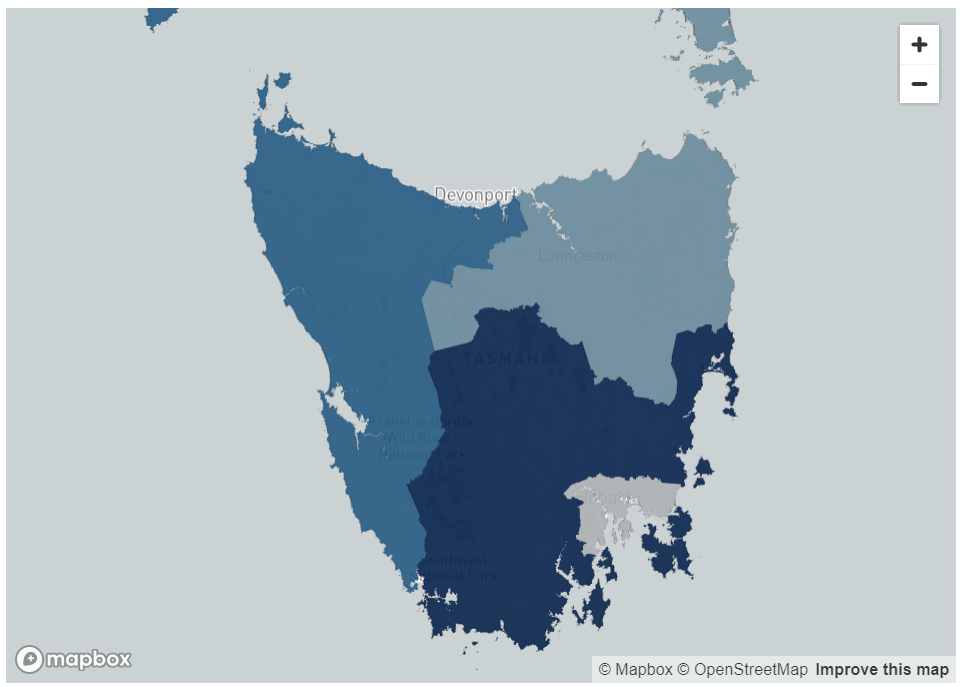
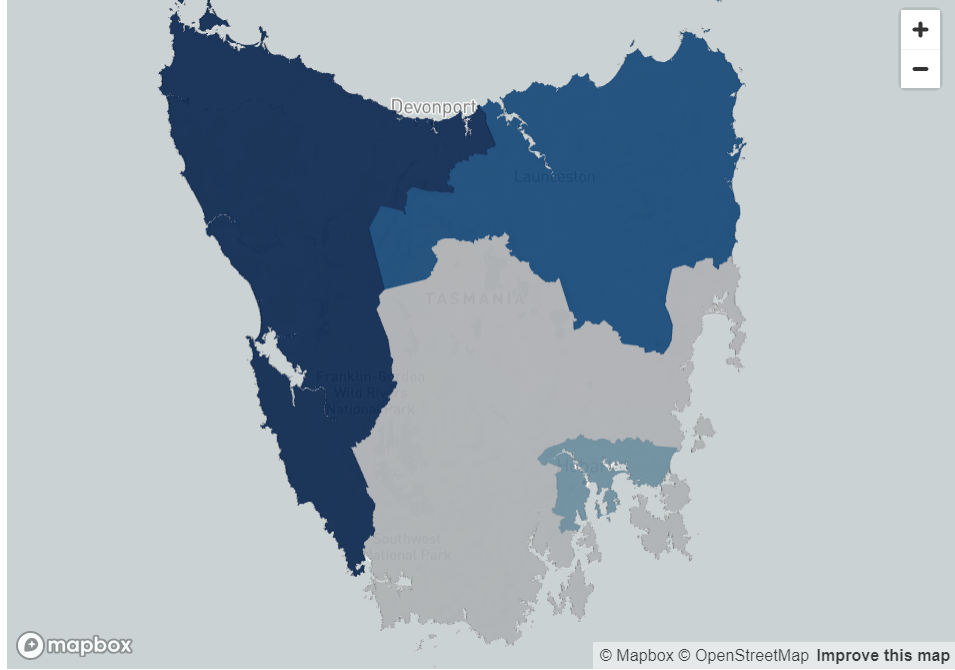
The visualisations below show the net migration metric for all Australian states.

Net migration is calculated by forecasting the number of people moving into an area subtracted by the number of people people moving out of an area.

White, grey and lighter blue colours indicate regions with lower net migration, representing regions where a high number of people are leaving the regions and a lower number of people are relocating into these regions.

Mid to darker blue colours represent regions with higher net migration, regions where the number of people moving to those regions outweigh the number of people leaving those regions.

The Results by State


New South Wales (NSW)

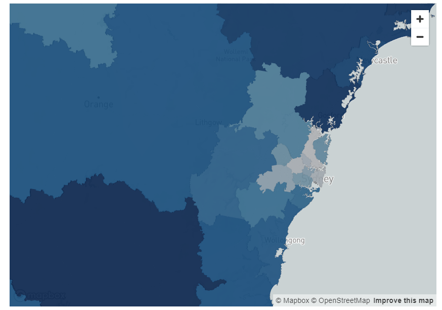
In NSW, prior to the pandemic, the light blue areas in the inner city areas indicate there was some movement in inner city areas including Chatswood, the Sydney Central Business District (CBD) and areas just west of the city.

However, there was a much higher level of migration into the areas much further west of the city including Penrith and Blaxland, as well as Newcastle.

The trend of moving away from the city has further increased since the COVID pandemic in NSW, where areas very close to the city show the lowest forecasted net migration in the state.

This indicates that people are moving away from the city. Some possible explanations for these movements could be due to rising rents or potentially due to the fact that they no longer need to live within metropolitan areas for work.

In NSW, rural areas south of the city close to Canberra such as Goulburn, and rural areas north of Newcastle such as Taree are the regions with the highest amount of forecasted net migration as shown by the visualisations below.

NSW Pre-COVID
NSW Post-COVID

Figure 1: Pre- and post-COVID migration per SA4 for New South Wales

Victoria

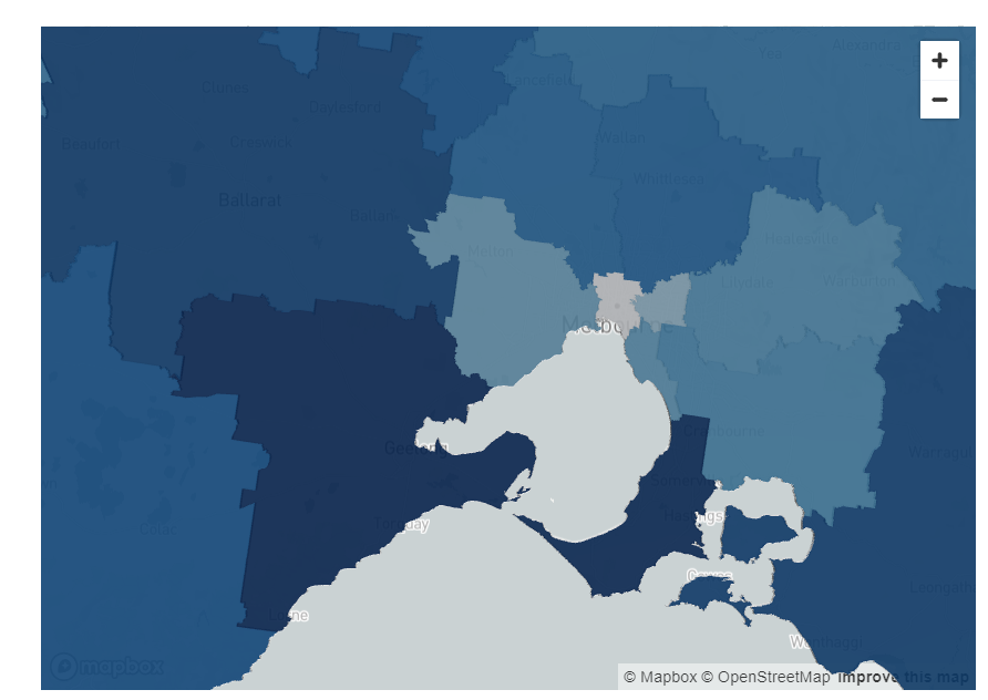
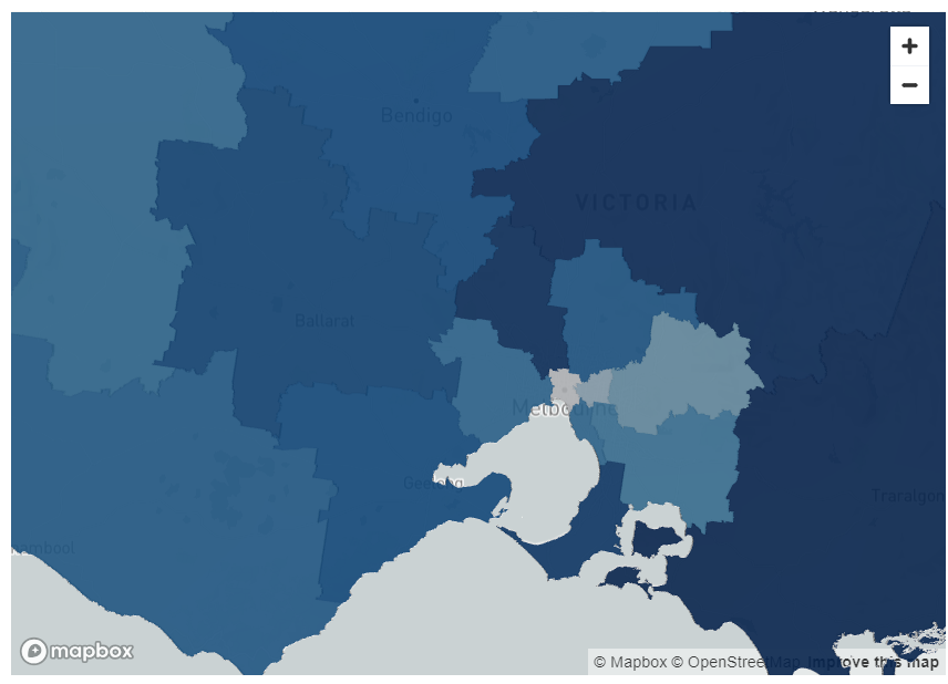
A similar trend can be observed in Victoria. Both pre- and post-pandemic, the areas which had the lowest net migration were the inner city Melbourne suburbs of Brunswick, North Melbourne and Fitzroy.

However, prior to the pandemic, the areas with the highest forecasted net migration was Geelong and the south coast of Melbourne.

Post-COVID, the areas with the highest forecasted migration are even further away, possibly indicating these coastal areas are now also less desirable or unaffordable.

These include rural areas including Warragul and Taree. Greenfield suburbs just north of the city including Sunbury also have high levels of forecasted migration.

VIC Pre-COVID
VIC Post-COVID

Figure 2: Pre- and post-COVID migration per SA4 for Victoria

Queensland

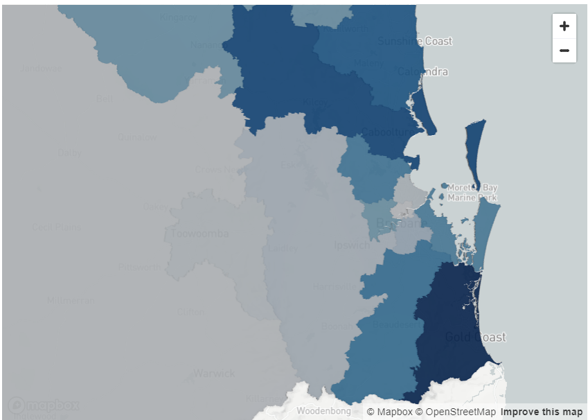
Like Melbourne, the forecasts for net migration in the inner city part of Brisbane is relatively similar both pre- and post-pandemic.

The inner city areas have low levels of forecasted net migration.

Interestingly, the highest amount of forecasted migration in Queensland prior to the pandemic was in the Gold Coast, which is only approximately an hour from Brisbane CBD.

Post-pandemic, areas further west of the Brisbane city including Ipswich, and Harrisville have higher levels of forecasted migration.

This could be indicative of people from Queensland relocating, but could also suggest people from interstate or overseas moving from other locations to places west of the city.

There is also a high level of migration predicted for the Sunshine Coast post-pandemic, further highlighting the trend also observed in Sydney and Melbourne of people moving into more rural areas.

QLD Pre-COVID
QLD Post-COVID

Figure 3: Pre- and post-COVID migration per SA4 for Queensland

South Australia

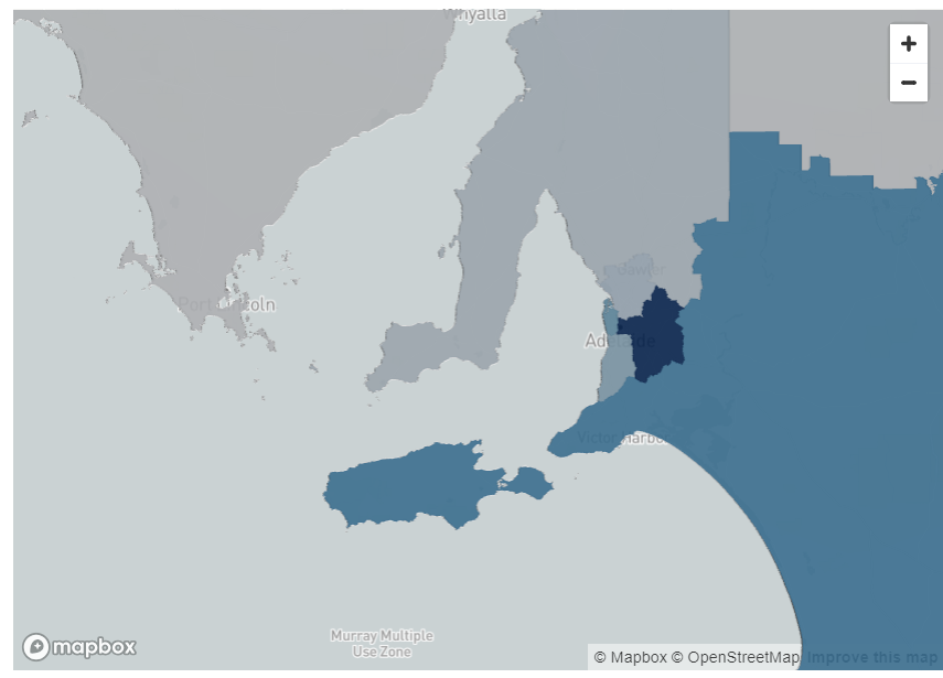
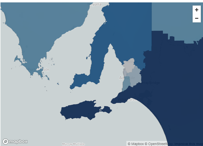
South Australia, unlike NSW, Victoria and Queensland is one of the few states where the highest forecasted pre-pandemic net migration was in an inner-city area.

However, the trend to relocate to rural areas was very high post-pandemic. Rural areas including Kangaroo Island, Murray Bridge and Clare had much higher forecasted net migration after the pandemic. This supports the trend observed in the other states.

SA Pre-COVID
SA Post-COVID

Figure 4: Pre- and post-COVID migration per SA4 for South Australia

Western Australia

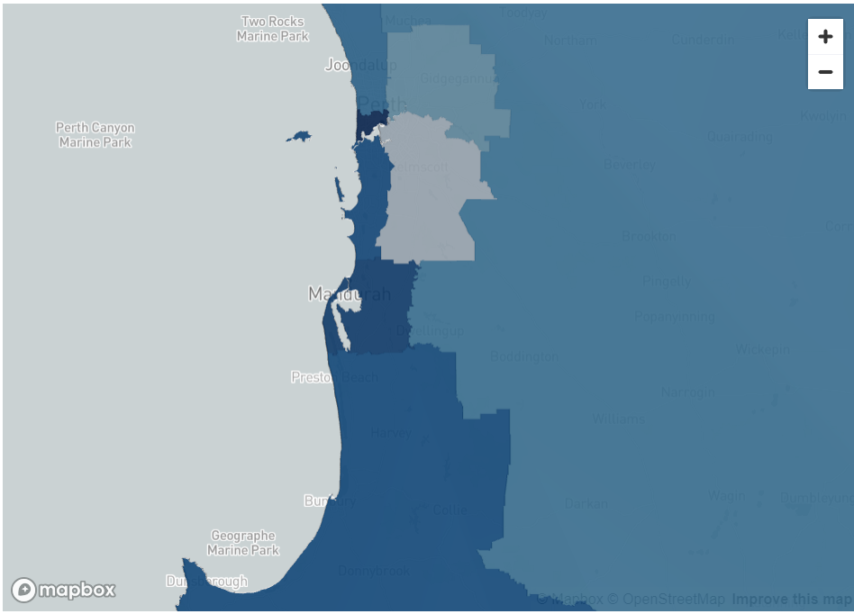
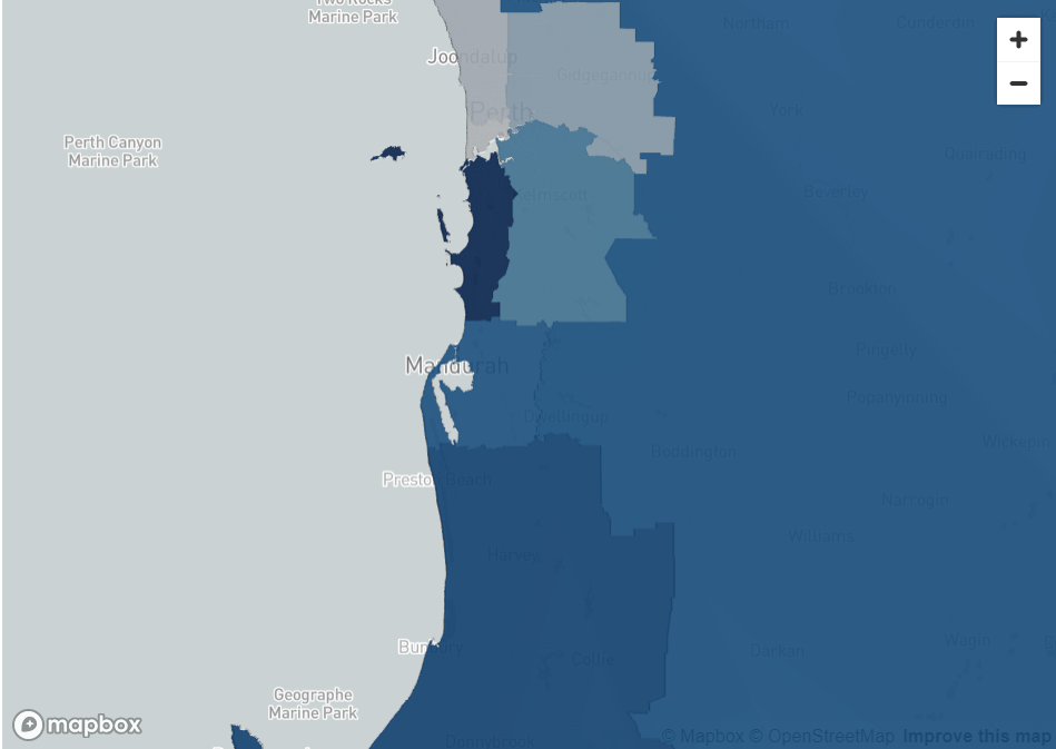
Western Australia is one of the few states where the forecasted net migration into rural areas is not high.

The pre-COVID migration forecasts indicate the highest level of net migration were in the Perth City area and post-COVID the highest amount of net migration was just south of the city.

One possible reason for this could be that while Perth house prices and rents have been rising, they are still much lower than Sydney or Melbourne, and therefore is still affordable for people to be able to live close to the city.

Secondly, as mining is the predominant industry in Western Australia, it is possible that it is not feasible for many of these workers to move and work remotely.

WA Pre-COVID
WA Post-COVID

Figure 5: Pre- and post-COVID migration per SA4 for Western Australia

Tasmania

Tasmania is the only Australian state where the amount of net migration into the inner city forecasts are higher post-covid as compared to pre-COVID.

Prior to COVID , Hobart had the lowest net migration compared to all other regions in Tasmania. However, post-COVID the amount of met migration in the CBD is higher, indicating people are moving into Hobart.

Similarly, the amount of forecasted migration into Launceston, Tasmania’s second biggest city, is higher post-COVID as compared to pre-COVID.

The reason that the same rural migration has not been seen in Tasmania, unlike other states, could be because of Tasmania’s population.

Hobart’s population is only approximately 250,000 which is smaller than rural areas that people were migrating to including the Sunshine Coast.

Thus, the high rental and accommodation costs that are evident in highly populated cities, including Sydney or Melbourne may not be evident in Tasmania.

TAS Pre-COVID
TAS Post-COVID

Figure 6: Pre- and post-COVID migration per SA4 for Tasmania

​Summary of Findings

In the period post-COVID there is high evidence of people migrating to rural areas, especially in states with larger CBDs such as New South Wales, Victoria and Brisbane.

Interestingly, in these states, people seemed to be migrating to outer-city areas even prior to the pandemic.

This may suggest that there were factors encouraging people to move out of the city. This trend seems to have increased further since COVID.

Overall, there is a clear trend in the two most populated states, New South Wales and Victoria for net migration into rural areas.

These were the two states that were most affected by COVID lockdowns in Australia and have the highest house prices in the country which may be one of the key the drivers behind the high level of relocation to rural areas.

Less populated states including South Australia and Queensland have experienced a similar trend with high levels of net migration to rural areas including Kangaroo Island, Clare and the Sunshine Coast.

The only states that haven’t experienced net migration to rural areas are Western Australia and Tasmania.

A Reflection of Australia’s Housing Situation

Australia is in the midst of a housing crisis where steep house prices prevent many first-home buyers from entering the market, especially in inner-city areas.

Driven by the low supply of rentals and high post-pandemic migration, rents continue to skyrocket in many metropolitan cites.

In Australia’s most populous metropolitan areas Sydney and Melbourne, rents rose by 10.2% and 11.1%1 from December 2022 to December 2023 respectively.

Since 2020, the COVID pandemic has transformed the workplace environment, by forcing some office workers to do their job remotely due to lockdowns and government restrictions.

To this day, some office workers continue to work remotely full or part time, meaning that when picking a place to live, they may not need to prioritise being within a reasonable commuting distance from their usual physical office.

The combination of unaffordable rents and mortgages in inner city areas and increase in work from home trends may have contributed to many Australians migrating to outer-city and rural locations.

Strategic Insights

The findings hold significant strategic value for both the private and public sectors.

Incorporating these insights alongside additional data points, such as overseas migration into Australia, enriches the analysis, providing a more comprehensive understanding of migration patterns.

This broader perspective can enhance strategic planning and decision-making processes across various industries and governmental levels.

Examples include real estate development, investment, business expansion, transportation and infrastructure decisions, as well as urban, land use, policy or even healthcare and public services planning.

These findings can offer a foundation for both private and public sectors to adapt to changing demographic patterns in a way that maximises economic opportunities while ensuring community well-being and sustainability.

About The Analysis

Data Army used the Australian Post Movers Statistics dataset to base the forecasts in migration patterns during and after the COVID pandemic in each Australian state.

The primary dataset used in this study is the Australia Post Movers Statistics. It contains de-identified and aggregated data on moves across Australia based on mail redirection requests from the previous 5 years.

For this exercise, data from February 2019 to January 2024 was used.

Each entry in the data includes

  • the postcode the household relocated from,
  • the postcode the household relocated to,
  • the month of relocation, and
  • the number of the people that relocated.

This analysis shows forecasted migrated trends for the next year when pre-pandemic data is used (Feb 2019 – Jan 2020) compared to forecasts based on mail redirection requests in the post-pandemic era (2022-2024).

The analysis was conducted on a Statistical Area Level 4 level which are Australian Bureau of Statistics (ABS) defined regions that clearly distinguish inner-city areas, outer-city areas and rural areas.

For a step-by-step guide, see our blog on How to Predict Migration Patterns using Auspost Movers Statistics Data and Snowflake’s Cortex ML functions>

Australia Post Movers Statistics Data

This dataset contains five years of de-identified, aggregated information on past moves captured by Australia Post’s Mail Redirection service.

Access Australia Post mail redirect statistics now to help you develop competitive data-driven strategies.

The intellectual property rights for all content in this blog are exclusively held by Data Army and The Proptech Cloud. All rights are reserved, and no content may be republished or reproduced without express written permission from us. All content provided is for informational purposes only. While we strive to ensure that the information provided here is both factual and accurate, we make no representations or warranties of any kind about the completeness, accuracy, reliability, suitability, or availability with respect to the blog or the information, products, services, or related graphics contained on the blog for any purpose.

Subscribe to our newsletter

Subscribe to receive the latest blogs and data listings direct to your inbox.

Data consultancy, Data Army dives into the Australia Post Movers Statistics dataset to understand where people are migrating to within Australia and predicting where they’re likely to move to next.

We explain the data visualisations created and documented in our previous blog How to Predict Migration Patterns using Auspost Movers Statistics Data and Snowflake’s Cortex ML functions>

By analysing movements and observing trends, we’re able to gather valuable insights to inspire decisions with data-driven intelligence.

How to Interpret the Data Visualisations

The visualisations below show the net migration metric for all Australian states.

Net migration is calculated by forecasting the number of people moving into an area subtracted by the number of people people moving out of an area.

White, grey and lighter blue colours indicate regions with lower net migration, representing regions where a high number of people are leaving the regions and a lower number of people are relocating into these regions.

Mid to darker blue colours represent regions with higher net migration, regions where the number of people moving to those regions outweigh the number of people leaving those regions.

The Results by State


New South Wales (NSW)

In NSW, prior to the pandemic, the light blue areas in the inner city areas indicate there was some movement in inner city areas including Chatswood, the Sydney Central Business District (CBD) and areas just west of the city.

However, there was a much higher level of migration into the areas much further west of the city including Penrith and Blaxland, as well as Newcastle.

The trend of moving away from the city has further increased since the COVID pandemic in NSW, where areas very close to the city show the lowest forecasted net migration in the state.

This indicates that people are moving away from the city. Some possible explanations for these movements could be due to rising rents or potentially due to the fact that they no longer need to live within metropolitan areas for work.

In NSW, rural areas south of the city close to Canberra such as Goulburn, and rural areas north of Newcastle such as Taree are the regions with the highest amount of forecasted net migration as shown by the visualisations below.

NSW Pre-COVID
NSW Post-COVID

Figure 1: Pre- and post-COVID migration per SA4 for New South Wales

Victoria

A similar trend can be observed in Victoria. Both pre- and post-pandemic, the areas which had the lowest net migration were the inner city Melbourne suburbs of Brunswick, North Melbourne and Fitzroy.

However, prior to the pandemic, the areas with the highest forecasted net migration was Geelong and the south coast of Melbourne.

Post-COVID, the areas with the highest forecasted migration are even further away, possibly indicating these coastal areas are now also less desirable or unaffordable.

These include rural areas including Warragul and Taree. Greenfield suburbs just north of the city including Sunbury also have high levels of forecasted migration.

VIC Pre-COVID
VIC Post-COVID

Figure 2: Pre- and post-COVID migration per SA4 for Victoria

Queensland

Like Melbourne, the forecasts for net migration in the inner city part of Brisbane is relatively similar both pre- and post-pandemic.

The inner city areas have low levels of forecasted net migration.

Interestingly, the highest amount of forecasted migration in Queensland prior to the pandemic was in the Gold Coast, which is only approximately an hour from Brisbane CBD.

Post-pandemic, areas further west of the Brisbane city including Ipswich, and Harrisville have higher levels of forecasted migration.

This could be indicative of people from Queensland relocating, but could also suggest people from interstate or overseas moving from other locations to places west of the city.

There is also a high level of migration predicted for the Sunshine Coast post-pandemic, further highlighting the trend also observed in Sydney and Melbourne of people moving into more rural areas.

QLD Pre-COVID
QLD Post-COVID

Figure 3: Pre- and post-COVID migration per SA4 for Queensland

South Australia

South Australia, unlike NSW, Victoria and Queensland is one of the few states where the highest forecasted pre-pandemic net migration was in an inner-city area.

However, the trend to relocate to rural areas was very high post-pandemic. Rural areas including Kangaroo Island, Murray Bridge and Clare had much higher forecasted net migration after the pandemic. This supports the trend observed in the other states.

SA Pre-COVID
SA Post-COVID

Figure 4: Pre- and post-COVID migration per SA4 for South Australia

Western Australia

Western Australia is one of the few states where the forecasted net migration into rural areas is not high.

The pre-COVID migration forecasts indicate the highest level of net migration were in the Perth City area and post-COVID the highest amount of net migration was just south of the city.

One possible reason for this could be that while Perth house prices and rents have been rising, they are still much lower than Sydney or Melbourne, and therefore is still affordable for people to be able to live close to the city.

Secondly, as mining is the predominant industry in Western Australia, it is possible that it is not feasible for many of these workers to move and work remotely.

WA Pre-COVID
WA Post-COVID

Figure 5: Pre- and post-COVID migration per SA4 for Western Australia

Tasmania

Tasmania is the only Australian state where the amount of net migration into the inner city forecasts are higher post-covid as compared to pre-COVID.

Prior to COVID , Hobart had the lowest net migration compared to all other regions in Tasmania. However, post-COVID the amount of met migration in the CBD is higher, indicating people are moving into Hobart.

Similarly, the amount of forecasted migration into Launceston, Tasmania’s second biggest city, is higher post-COVID as compared to pre-COVID.

The reason that the same rural migration has not been seen in Tasmania, unlike other states, could be because of Tasmania’s population.

Hobart’s population is only approximately 250,000 which is smaller than rural areas that people were migrating to including the Sunshine Coast.

Thus, the high rental and accommodation costs that are evident in highly populated cities, including Sydney or Melbourne may not be evident in Tasmania.

TAS Pre-COVID
TAS Post-COVID

Figure 6: Pre- and post-COVID migration per SA4 for Tasmania

​Summary of Findings

In the period post-COVID there is high evidence of people migrating to rural areas, especially in states with larger CBDs such as New South Wales, Victoria and Brisbane.

Interestingly, in these states, people seemed to be migrating to outer-city areas even prior to the pandemic.

This may suggest that there were factors encouraging people to move out of the city. This trend seems to have increased further since COVID.

Overall, there is a clear trend in the two most populated states, New South Wales and Victoria for net migration into rural areas.

These were the two states that were most affected by COVID lockdowns in Australia and have the highest house prices in the country which may be one of the key the drivers behind the high level of relocation to rural areas.

Less populated states including South Australia and Queensland have experienced a similar trend with high levels of net migration to rural areas including Kangaroo Island, Clare and the Sunshine Coast.

The only states that haven’t experienced net migration to rural areas are Western Australia and Tasmania.

A Reflection of Australia’s Housing Situation

Australia is in the midst of a housing crisis where steep house prices prevent many first-home buyers from entering the market, especially in inner-city areas.

Driven by the low supply of rentals and high post-pandemic migration, rents continue to skyrocket in many metropolitan cites.

In Australia’s most populous metropolitan areas Sydney and Melbourne, rents rose by 10.2% and 11.1%1 from December 2022 to December 2023 respectively.

Since 2020, the COVID pandemic has transformed the workplace environment, by forcing some office workers to do their job remotely due to lockdowns and government restrictions.

To this day, some office workers continue to work remotely full or part time, meaning that when picking a place to live, they may not need to prioritise being within a reasonable commuting distance from their usual physical office.

The combination of unaffordable rents and mortgages in inner city areas and increase in work from home trends may have contributed to many Australians migrating to outer-city and rural locations.

Strategic Insights

The findings hold significant strategic value for both the private and public sectors.

Incorporating these insights alongside additional data points, such as overseas migration into Australia, enriches the analysis, providing a more comprehensive understanding of migration patterns.

This broader perspective can enhance strategic planning and decision-making processes across various industries and governmental levels.

Examples include real estate development, investment, business expansion, transportation and infrastructure decisions, as well as urban, land use, policy or even healthcare and public services planning.

These findings can offer a foundation for both private and public sectors to adapt to changing demographic patterns in a way that maximises economic opportunities while ensuring community well-being and sustainability.

About The Analysis

Data Army used the Australian Post Movers Statistics dataset to base the forecasts in migration patterns during and after the COVID pandemic in each Australian state.

The primary dataset used in this study is the Australia Post Movers Statistics. It contains de-identified and aggregated data on moves across Australia based on mail redirection requests from the previous 5 years.

For this exercise, data from February 2019 to January 2024 was used.

Each entry in the data includes

  • the postcode the household relocated from,
  • the postcode the household relocated to,
  • the month of relocation, and
  • the number of the people that relocated.

This analysis shows forecasted migrated trends for the next year when pre-pandemic data is used (Feb 2019 – Jan 2020) compared to forecasts based on mail redirection requests in the post-pandemic era (2022-2024).

The analysis was conducted on a Statistical Area Level 4 level which are Australian Bureau of Statistics (ABS) defined regions that clearly distinguish inner-city areas, outer-city areas and rural areas.

For a step-by-step guide, see our blog on How to Predict Migration Patterns using Auspost Movers Statistics Data and Snowflake’s Cortex ML functions>

Australia Post Movers Statistics Data

This dataset contains five years of de-identified, aggregated information on past moves captured by Australia Post’s Mail Redirection service.

Access Australia Post mail redirect statistics now to help you develop competitive data-driven strategies.

The intellectual property rights for all content in this blog are exclusively held by Data Army and The Proptech Cloud. All rights are reserved, and no content may be republished or reproduced without express written permission from us. All content provided is for informational purposes only. While we strive to ensure that the information provided here is both factual and accurate, we make no representations or warranties of any kind about the completeness, accuracy, reliability, suitability, or availability with respect to the blog or the information, products, services, or related graphics contained on the blog for any purpose.

Subscribe to our newsletter

Subscribe to receive the latest blogs and data listings direct to your inbox.
Data consultancy, Data Army dives into the Australia Post Movers Statistics dataset to understand where people are migrating to within Australia and predicting where they’re likely to move to next.

We explain the data visualisations created and documented in our previous blog How to Predict Migration Patterns using Auspost Movers Statistics Data and Snowflake’s Cortex ML functions>

By analysing movements and observing trends, we’re able to gather valuable insights to inspire decisions with data-driven intelligence.

How to Interpret the Data Visualisations

The visualisations below show the net migration metric for all Australian states.

Net migration is calculated by forecasting the number of people moving into an area subtracted by the number of people people moving out of an area.

White, grey and lighter blue colours indicate regions with lower net migration, representing regions where a high number of people are leaving the regions and a lower number of people are relocating into these regions.

Mid to darker blue colours represent regions with higher net migration, regions where the number of people moving to those regions outweigh the number of people leaving those regions.

The Results by State


New South Wales (NSW)

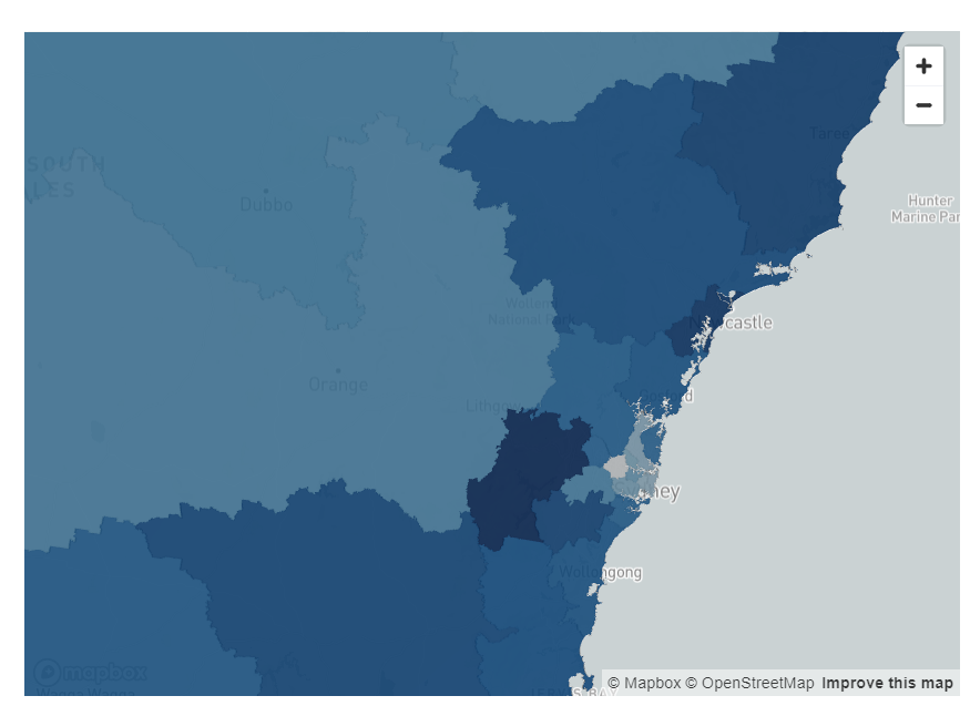
In NSW, prior to the pandemic, the light blue areas in the inner city areas indicate there was some movement in inner city areas including Chatswood, the Sydney Central Business District (CBD) and areas just west of the city.

However, there was a much higher level of migration into the areas much further west of the city including Penrith and Blaxland, as well as Newcastle.

The trend of moving away from the city has further increased since the COVID pandemic in NSW, where areas very close to the city show the lowest forecasted net migration in the state.

This indicates that people are moving away from the city. Some possible explanations for these movements could be due to rising rents or potentially due to the fact that they no longer need to live within metropolitan areas for work.

In NSW, rural areas south of the city close to Canberra such as Goulburn, and rural areas north of Newcastle such as Taree are the regions with the highest amount of forecasted net migration as shown by the visualisations below.

NSW Pre-COVID
NSW Post-COVID

Figure 1: Pre- and post-COVID migration per SA4 for New South Wales

Victoria

A similar trend can be observed in Victoria. Both pre- and post-pandemic, the areas which had the lowest net migration were the inner city Melbourne suburbs of Brunswick, North Melbourne and Fitzroy.

However, prior to the pandemic, the areas with the highest forecasted net migration was Geelong and the south coast of Melbourne.

Post-COVID, the areas with the highest forecasted migration are even further away, possibly indicating these coastal areas are now also less desirable or unaffordable.

These include rural areas including Warragul and Taree. Greenfield suburbs just north of the city including Sunbury also have high levels of forecasted migration.

VIC Pre-COVID
VIC Post-COVID

Figure 2: Pre- and post-COVID migration per SA4 for Victoria

Queensland

Like Melbourne, the forecasts for net migration in the inner city part of Brisbane is relatively similar both pre- and post-pandemic.

The inner city areas have low levels of forecasted net migration.

Interestingly, the highest amount of forecasted migration in Queensland prior to the pandemic was in the Gold Coast, which is only approximately an hour from Brisbane CBD.

Post-pandemic, areas further west of the Brisbane city including Ipswich, and Harrisville have higher levels of forecasted migration.

This could be indicative of people from Queensland relocating, but could also suggest people from interstate or overseas moving from other locations to places west of the city.

There is also a high level of migration predicted for the Sunshine Coast post-pandemic, further highlighting the trend also observed in Sydney and Melbourne of people moving into more rural areas.

QLD Pre-COVID
QLD Post-COVID

Figure 3: Pre- and post-COVID migration per SA4 for Queensland

South Australia

South Australia, unlike NSW, Victoria and Queensland is one of the few states where the highest forecasted pre-pandemic net migration was in an inner-city area.

However, the trend to relocate to rural areas was very high post-pandemic. Rural areas including Kangaroo Island, Murray Bridge and Clare had much higher forecasted net migration after the pandemic. This supports the trend observed in the other states.

SA Pre-COVID
SA Post-COVID

Figure 4: Pre- and post-COVID migration per SA4 for South Australia

Western Australia

Western Australia is one of the few states where the forecasted net migration into rural areas is not high.

The pre-COVID migration forecasts indicate the highest level of net migration were in the Perth City area and post-COVID the highest amount of net migration was just south of the city.

One possible reason for this could be that while Perth house prices and rents have been rising, they are still much lower than Sydney or Melbourne, and therefore is still affordable for people to be able to live close to the city.

Secondly, as mining is the predominant industry in Western Australia, it is possible that it is not feasible for many of these workers to move and work remotely.

WA Pre-COVID
WA Post-COVID

Figure 5: Pre- and post-COVID migration per SA4 for Western Australia

Tasmania

Tasmania is the only Australian state where the amount of net migration into the inner city forecasts are higher post-covid as compared to pre-COVID.

Prior to COVID , Hobart had the lowest net migration compared to all other regions in Tasmania. However, post-COVID the amount of met migration in the CBD is higher, indicating people are moving into Hobart.

Similarly, the amount of forecasted migration into Launceston, Tasmania’s second biggest city, is higher post-COVID as compared to pre-COVID.

The reason that the same rural migration has not been seen in Tasmania, unlike other states, could be because of Tasmania’s population.

Hobart’s population is only approximately 250,000 which is smaller than rural areas that people were migrating to including the Sunshine Coast.

Thus, the high rental and accommodation costs that are evident in highly populated cities, including Sydney or Melbourne may not be evident in Tasmania.

TAS Pre-COVID
TAS Post-COVID

Figure 6: Pre- and post-COVID migration per SA4 for Tasmania

​Summary of Findings

In the period post-COVID there is high evidence of people migrating to rural areas, especially in states with larger CBDs such as New South Wales, Victoria and Brisbane.

Interestingly, in these states, people seemed to be migrating to outer-city areas even prior to the pandemic.

This may suggest that there were factors encouraging people to move out of the city. This trend seems to have increased further since COVID.

Overall, there is a clear trend in the two most populated states, New South Wales and Victoria for net migration into rural areas.

These were the two states that were most affected by COVID lockdowns in Australia and have the highest house prices in the country which may be one of the key the drivers behind the high level of relocation to rural areas.

Less populated states including South Australia and Queensland have experienced a similar trend with high levels of net migration to rural areas including Kangaroo Island, Clare and the Sunshine Coast.

The only states that haven’t experienced net migration to rural areas are Western Australia and Tasmania.

A Reflection of Australia’s Housing Situation

Australia is in the midst of a housing crisis where steep house prices prevent many first-home buyers from entering the market, especially in inner-city areas.

Driven by the low supply of rentals and high post-pandemic migration, rents continue to skyrocket in many metropolitan cites.

In Australia’s most populous metropolitan areas Sydney and Melbourne, rents rose by 10.2% and 11.1%1 from December 2022 to December 2023 respectively.

Since 2020, the COVID pandemic has transformed the workplace environment, by forcing some office workers to do their job remotely due to lockdowns and government restrictions.

To this day, some office workers continue to work remotely full or part time, meaning that when picking a place to live, they may not need to prioritise being within a reasonable commuting distance from their usual physical office.

The combination of unaffordable rents and mortgages in inner city areas and increase in work from home trends may have contributed to many Australians migrating to outer-city and rural locations.

Strategic Insights

The findings hold significant strategic value for both the private and public sectors.

Incorporating these insights alongside additional data points, such as overseas migration into Australia, enriches the analysis, providing a more comprehensive understanding of migration patterns.

This broader perspective can enhance strategic planning and decision-making processes across various industries and governmental levels.

Examples include real estate development, investment, business expansion, transportation and infrastructure decisions, as well as urban, land use, policy or even healthcare and public services planning.

These findings can offer a foundation for both private and public sectors to adapt to changing demographic patterns in a way that maximises economic opportunities while ensuring community well-being and sustainability.

About The Analysis

Data Army used the Australian Post Movers Statistics dataset to base the forecasts in migration patterns during and after the COVID pandemic in each Australian state.

The primary dataset used in this study is the Australia Post Movers Statistics. It contains de-identified and aggregated data on moves across Australia based on mail redirection requests from the previous 5 years.

For this exercise, data from February 2019 to January 2024 was used.

Each entry in the data includes

  • the postcode the household relocated from,
  • the postcode the household relocated to,
  • the month of relocation, and
  • the number of the people that relocated.

This analysis shows forecasted migrated trends for the next year when pre-pandemic data is used (Feb 2019 – Jan 2020) compared to forecasts based on mail redirection requests in the post-pandemic era (2022-2024).

The analysis was conducted on a Statistical Area Level 4 level which are Australian Bureau of Statistics (ABS) defined regions that clearly distinguish inner-city areas, outer-city areas and rural areas.

For a step-by-step guide, see our blog on How to Predict Migration Patterns using Auspost Movers Statistics Data and Snowflake’s Cortex ML functions>

Australia Post Movers Statistics Data

This dataset contains five years of de-identified, aggregated information on past moves captured by Australia Post’s Mail Redirection service.

Access Australia Post mail redirect statistics now to help you develop competitive data-driven strategies.

The intellectual property rights for all content in this blog are exclusively held by Data Army and The Proptech Cloud. All rights are reserved, and no content may be republished or reproduced without express written permission from us. All content provided is for informational purposes only. While we strive to ensure that the information provided here is both factual and accurate, we make no representations or warranties of any kind about the completeness, accuracy, reliability, suitability, or availability with respect to the blog or the information, products, services, or related graphics contained on the blog for any purpose.

Subscribe to our newsletter

Subscribe to receive the latest blogs and data listings direct to your inbox.
Read more blogs from The Proptech Cloud

Crafting a Storm Surge and Hurricane Risk Rating for Coastal Properties

A high-level approach to developing a storm surge and hurricane risk rating system to guide stakeholders with a vested interest in coastal properties.

How Proptech Is Revolutionising Real Estate

Proptech is the dynamic intersection of property and technology, and it’s reshaping real estate. And there’s still a huge potential for growth.

What is the Australian Statistical Geography Standard (ASGS)?

The ASGS is used to better understand where people live and how communities are formed.

How to Incorporate Mesh Blocks into Datasets

Mesh blocks can enhance the precision and relevance of geospatial and proptech analyses. Here are some tips and steps to incorporate mesh blocks into datasets.

Australia’s Migration Trends: Where Are People Moving To?

This detailed visual analysis for Australia’s major capital cities breaks down how net migration trends are evolving across different regions.

How to Predict Migration Patterns using Auspost Movers Statistics Data and Snowflake’s Cortex ML functions

How to Predict Migration Patterns using Auspost Movers Statistics Data and Snowflake’s Cortex ML functions

Data consultancy, Data Army taps into the hidden insights of the Australia Post Movers Statistics dataset to forecast the future hotspots in Australia—predicting where people are likely to move next.

By analysing trends in mail redirection requests through the Time Series Forecasting function, we provide valuable insights with precision.

This advanced analysis is a feature of Snowflake Cortex, Snowflake’s comprehensive Artificial Intelligence and Machine Learning service, designed to empower your decisions with data-driven intelligence.

Overview of Data Used

  • The primary dataset is Australia Post’s Movers Statistics currently available from The Proptech Cloud with a limited free trial. Updated monthly, it contains de-identified and aggregated data on moves across Australia based on mail redirection requests for the previous 5 years. For this exercise, we used the data from February 2019 to January 2024. Each entry in the data includes the postcode the household relocated from, the postcode the household relocated to, the month of relocation and the number of the people that relocated.
  • The secondary dataset used is the Geography Boundaries & Insights – Australia, specifically Australian Bureau of Statistics (ABS) 2021 Postcode Boundary Data (ABS_POA_2021_AUST_GDA2020) to conduct geospatial visualisations. This dataset is free from The Proptech Cloud.

Australia Post Movers Statistics Data

This dataset contains five years of de-identified, aggregated information on past moves captured by Australia Post’s Mail Redirection service.

Access Australia Post mail redirect statistics now to help you develop competitive data-driven strategies.

Introduction to Snowflake Functionality & Technology Stack

  • The Snowflake Forecasting Model is part of the Snowflake Cortex ML- Powered Functions. This model uses a Machine Learning algorithm to predict future trends from historical data.
  • SnowPark which is the set of libraries in Snowflake which will allow us to deploy and process the data pipeline using Python
  • Streamlit which is used to visualise the forecasts created using interactive Python apps. This functionality is fully integrated within the Snowflake Platform

Introduction to Snowflake’s Forecasting Model

Snowflake Cortex is a service by Snowflake which offers Machine Learning (ML) and Artificial Intelligence (AI) solutions.

This blog will focus on using the Time-Series Forecasting Model which is part of this service. The ML forecasting model used in this algorithm is Gradient Boosting (GB).

The intuition behind the GB algorithm is that the combination of multiple models that learn and improve on each other will perform better than one model. To implement this approach, the GB algorithm will firstly implement the best possible model on the dataset.

The second model will assess where the first model performs poorly and try to improve on these areas. This process continues and the models continue to learn and iterate on one another until the model iteration process no longer improves the model outcomes and therefore the optimal model combination is found and used for predictions.

The GB algorithm is very popular due to its ability to learn from itself and it performs very strongly in many different ML problems. One of the typical challenges in using the GB model is that it is usually very computationally expensive and time consuming to iterate and find the optimal model. The advantage of using the Snowflake Cortex Machine Learning Powered Forecasting Model is that it is extremely quick to compute on even very large datasets as it leverages Snowflake’s existing highly scalable infrastructure.

Technical How-To Guide

The forecasting model example shown will use Snowpark to create the data pipeline and use Streamlit for the data visualisations.

Step 1: Accessing the data

  1. Go to the link on the listing to access the Australia Post – Movers Statistics Data.
  2. Click the “Access Data Listing on Snowflake Marketplace” button to access the data listing on the Snowflake Marketplace
  3. Click the ‘Get’ button and the top right of the page to access the Australian Post Movers Statistics dataset. This will then redirect to a link to either create a new Snowflake account or sign in if one already exists.
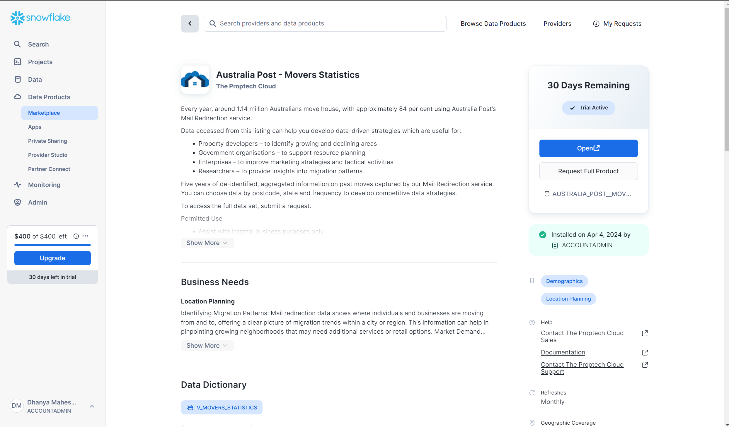
  4. Once your Snowflake account is set up and running , the Australia post Mover Statistics dataset listing is located within Data Products and then Marketplace as shown by the link below:
Snowflake Marketplace screen

5. Click on the Open button to explore the sample data within the Snowflake Environment. This will redirect to a Snowflake worksheet which will show some sample queries.

6. The full product can also be requested from the Marketplace page with the button ‘Request Full Product’ if access to the entire dataset is needed.

Step 2: Setting Up the Example Data

The forecasting model created is a multi-time-series model. The following types of variables were needed to create this:

  • The series variable to create multiple time series forecasting
  • A timestamp column
  • A target column which includes a quantity of interest at each timestamp

The cleaning and transformation of the dataset to prep the data for forecasted was completed by running SQL queries using Snowpark. A sample of this data is shown below:

Snowflake Marketplace - tables
This data is then saved as a view named migration_people_moving_to to use in the forecasting model.

Step 3: Creating the Forecasting Model

Each row in the migration_people_moving_to view corresponds to the three types of columns needed to create a multi-series forecasting model; the postcode (series column), month (timestamp column) and the number of people who moved into the postcode that month (the target column)

The code to create a forecasting model is as follows:

CREATE OR REPLACE SNOWFLAKE.ML.FORECAST forecasting_model_people_to (

INPUT_DATA => SYSTEM$REFERENCE(‘VIEW’, ‘migration_people_moving_to’),

SERIES_COLNAME => ‘to_postcode’,

TIMESTAMP_COLNAME => ‘timestamp_month’,

TARGET_COLNAME => ‘number_of_people_to_postcode’

)

This will create the forecasting model forecasting_model_people_to

Step 4: Calling and Interpreting the Forecasting Model

The model can then be used to forecast for any number of periods in the future. The model will perform better for forecasting periods that are closer training dataset, and are less reliable when it is used to forecast for periods further into the future.

The code used to forecast the number of people moving into a postcode every month for 12 months and save it to a table is shown below.

BEGIN

CALL forecasting_model_people_to!FORECAST(FORECASTING_PERIODS => 12);

LET x := SQLID;

CREATE OR REPLACE TABLE forecast_12periods_move_to AS

SELECT * FROM TABLE(RESULT_SCAN(:x));

END;

An example of the forecasting model output results are shown below.

Snowflake Marketplace - forecasting model output results

The way to interpret the above output would be to say that the number of people forecasted to move into Postcode 5096 (which covers Para Hills, Para Hills West, Gulfview Heights, Adelaide) in April 2024 is approximately 26. The lower bound and upper bound of 12.6 and 38.7 represent the prediction interval. For the April 2024 forecast into Para Hills, the model is 95% confident that the number of people who will move into postcode 5096 in April 2024 is between 12.6 and 38.7. A smaller prediction interval indicates that there is less error in the model and the estimated forecast is more likely to be accurate and vice versa.

The default prediction interval when calling a model in Snowflake is 95%. However, this can be configured when calling the model by adding a prediction interval. The code below shows how to call a model with an 80% prediction interval:

CALL forecasting_model_people_to!FORECAST(FORECASTING_PERIODS => 12, CONFIG_OBJECT => {'prediction_interval': 0.8})

Step 5: Visualising the forecasts using Snowpark and Streamlit

The 12 months results of the forecasting model were then aggregated to produce the total of number people forecasted to move into each postcode across Australia.

The data was then also joined with the Australian Postcode boundaries from the Geography Boundaries & Insights – Australia to allow for geospatial visualisations.

The visualisations were hosted using Streamlit within the Snowflake User Interface.

Streamlit is an open source python library which allows for the creation and sharing of data web applications. Using Streamlit within the Snowflake console allows for the flexibility to securely clean, transform and visualise the data in one place, without the need for any external environments.

Data Visualisation – Greater Melbourne Region

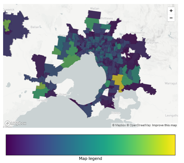
The visualisation shows the postcodes that people are moving to in the Greater Melbourne region.

The green and yellow regions show the places where high numbers of people are forecasted to move into in the next year, while the purple and blue regions show the regions that are forecasted to have a lower amount of relocation in the next year.

Interestingly, the visualisation shows that places in the outer East including Cranbourne, Clyde North and the outer west including Point Cook and Werribee South. The inner city postcodes which include suburbs such as Fitzroy, Brunswick and North Melbourne are forecasted to have much less migration in the next year.

Streamlit - Data Visualisation of migrations
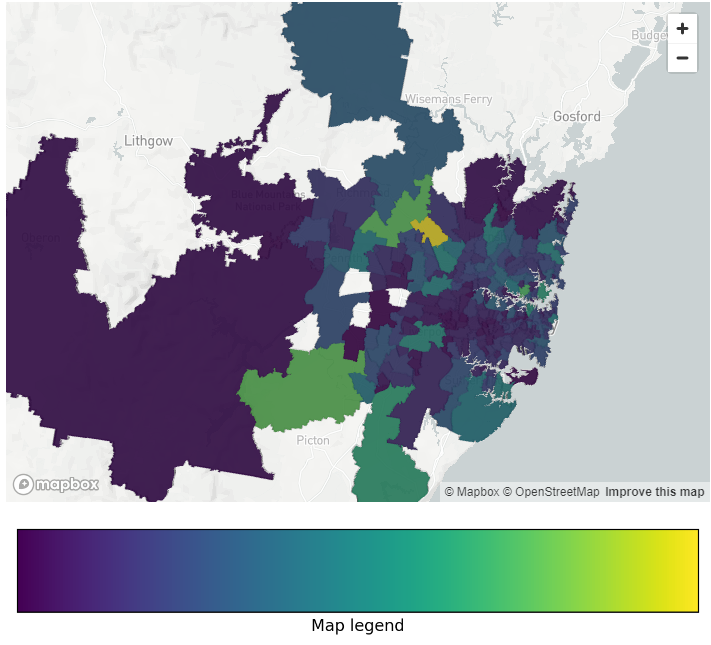
Streamlit - Data Visualisation of migrations SYD

Data Visualisation – Greater Sydney Region

A similar visualisation was done in the Greater Sydney area, where a similar trend was observed.

High levels of migration are forecasted for outer-city areas including Kellyville and North Kellyville and outer-city south west south west areas including Camden and Oran Park.

Like Melbourne, there seems to be less migration forecasted for inner city suburbs including Chippendale, Ultimo and Redfern.

Steps to Create the Visualisations

The following steps were performed to create the geospatial visualisations.

Firstly, the base steps to create a Streamlit App were completed. This includes creating an app and selecting a warehouse to run the queries. This will then create a Snowpark worksheet which allows the creation of a Streamlit app using Python. The Streamlit environment also needs to be set up to allow for the ingestion of packages which requires the CREATE STREAMLIT permission.

The third-party packages were then ingested using the Packages tab at the top of the worksheet. Only packages which are supported by Snowflake are able to be ingested to ensure that the Snowflake platform remains secure. Both Matplotlib and Pydeck were ingested to create these visualisations.

The required packages were then imported to create the Streamlit visualisation

# Import python packages

import streamlit as st

from snowflake.snowpark.context import get_active_session

import json

import pydeck as pdk

import matplotlib.pyplot as plt

import matplotlib as mpl

The Snowpark package was used to connect the worksheet to the table containing the 12 month forecasting data in Snowflake. The postcode geospatial boundaries were also obtained, joined to the forecasting data and converted into a geojson format. This was achieved using the code below:

session = get_active_session()


session.sql ("""SELECT

POA_CODE_2021 as POSTCODE_NAME,

NUMBER_OF_PEOPLE,

ST_ASGEOJSON(geometry) AS geojson

FROM

forecast_12periods_move_to --forecasting model table created in Step 3


INNER JOIN ABS_POA_2021_AUST_GDA2020

ON POA_CODE_2021 = TO_POSTCODE

""").collect()

Each row in the query represents the postcode, the number of people forecasted to move into the postcode in the next year and a geojson representing to geometry of the postcode boundary. Further transformations were done on the result so that each row in the query result was transformed into a dictionary. A key aspect of this transformation was assigning RGB colour code to each postcode depending on the number of people forecasted to migrate to that postcode. A sample of the geojson format is shown below:

map_geojson = {

"type": "FeatureCollection",

"features":[

{"type": "Feature",

"properties":

  {"postcode": 2000,

'colour':(68, 1, 84)

  },

"geometry":{'geometry in geosjon format'}

},

{"type": "Feature",

"properties":

   {"postcode": 2000,

'colour':(38, 130, 142)

 },

"geometry":{'geometry in geosjon format'}

},

]

}

The base chloropeth map was then set up by assigning the centre and zoom point for the map to render.

pydeck_chloropeth = pdk.Deck(

map_style=None,
initial_view_state=pdk.ViewState(

latitude={insert centre latitude},
longitude={insert centre longitude},
zoom={insert zoom level},

),

The geojson created in the step above was then added to the base map to create the chloropeth layer using the code below.

layers=[

pdk.Layer(

"GeoJsonLayer",

map_geojson, #name of the goejson created earlier

opacity=0.8,

stroked=False,

filled=True,

extruded=True,

wireframe=True,

get_fill_color='properties.colour',

get_line_color=[255, 255, 255],

)

],

)

The legend on the map was created using the colorbar function in the matplotlib library.

fig, ax = plt.subplots(figsize=(6, 1), layout='constrained')

cmap = mpl.cm.viridis
norm = mpl.colors.Normalize(vmin=0, vmax=1)

fig.colorbar(mpl.cm.ScalarMappable(norm=norm, cmap=cmap),

cax=ax, orientation='horizontal', label='Map legend', ticks=[])

Finally, the following lines of code were used to render both the chloropeth map and the legend on the Streamlit app.

st.pydeck_chart(pydeck_chloropeth)

st.pyplot(fig)

Summary

In this blog, the Australia Post Movers Statistics Marketplace listing was used along with Snowflake's Cortex ML Forecasting function to forecast the postcodes within Australia that have high levels of population movement.

The Streamlit data visualisations revealed that the postcodes that the highest amount of people were forecasted to move into were predominantly located in the outer-city area. Read our following blog to understand where people are moving to.

The rundown above highlights how the Snowflake Data Platform makes it straightforward for businesses to access quality data and market-leading compute, AI and visualisations all on one neat platform.


Australia Post Movers Statistics Data

This dataset contains five years of de-identified, aggregated information on past moves captured by Australia Post's Mail Redirection service.

Access Australia Post mail redirect statistics now to help you develop competitive data-driven strategies.

The intellectual property rights for all content in this blog are exclusively held by Data Army and The Proptech Cloud. All rights are reserved, and no content may be republished or reproduced without express written permission from us. All content provided is for informational purposes only. While we strive to ensure that the information provided here is both factual and accurate, we make no representations or warranties of any kind about the completeness, accuracy, reliability, suitability, or availability with respect to the blog or the information, products, services, or related graphics contained on the blog for any purpose.

Subscribe to our newsletter

Subscribe to receive the latest blogs and data listings direct to your inbox.
Read more blogs from The Proptech Cloud

Crafting a Storm Surge and Hurricane Risk Rating for Coastal Properties

A high-level approach to developing a storm surge and hurricane risk rating system to guide stakeholders with a vested interest in coastal properties.

How Proptech Is Revolutionising Real Estate

Proptech is the dynamic intersection of property and technology, and it’s reshaping real estate. And there’s still a huge potential for growth.

What is the Australian Statistical Geography Standard (ASGS)?

The ASGS is used to better understand where people live and how communities are formed.

How to Incorporate Mesh Blocks into Datasets

Mesh blocks can enhance the precision and relevance of geospatial and proptech analyses. Here are some tips and steps to incorporate mesh blocks into datasets.

Australia’s Migration Trends: Where Are People Moving To?

This detailed visual analysis for Australia’s major capital cities breaks down how net migration trends are evolving across different regions.

Could a Revamp of Australian Property Planning Rules Solve Some of Australia’s Housing Issues?

Could a Revamp of Australian Property Planning Rules Solve Some of Australia’s Housing Issues?

Rising property prices and high costs of living means the Australian dream of home ownership is slipping further and further away for many. Could an overhaul of Australian property planning rules offer a solution?

In recent discussions during a heated ABC Q+A debate on Homeownership, Homelessness & Housing supply, the Australian dream of homeownership has taken centre stage again, unveiling a crisis that grips not just potential homeowners but extends its grasp towards the homeless and vulnerable communities across the nation.

Even those “fortunate” enough to have purchased property are feeling significant interest rate stress as cost-of-living soars in recent times. Renters are experiencing rent hikes and dealing with historically low vacancy rates.

Australia’s housing issues in the spotlight

“Fundamentally, the problem is that we’re not building enough homes,” Mr Leigh, the Assistant Minister for Competition, Charities and Treasury, told Q+A.

It’s clear that Australia requires millions more homes to meet current demand but also accommodate future population growth.

However, as it stands, governments are finding it challenging to meet their own targets.

The debate, and followed up by The Sydney Morning Herald article Do planning rules really affect house prices? The answer is clear, has cast a spotlight on a host of interconnected factors contributing to this issue.

At the heart of the matter are planning and zoning rules, which, contrary to some beliefs, significantly influence housing prices and supply. This is a contentious point, highlighted by the disagreement between Max Chandler-Mather, Greens Spokesperson on Housing & Homelessness, and Dan McKenna, CEO of Nightingale Housing, pointing to a deeper complexity within the debate.

While Shadow Assistant Minister for Home Ownership, Senator Andrew Bragg’s remarks on construction industry, skills shortage and migration underscores the multifaceted approach needed to address the crisis.

This crisis reflects broader societal issues—including a shortage in construction and trades to debates on policy, immigration, and infrastructure development.

The challenges extend to financial mechanisms of owning a home, with strategies like tapping into superannuation funds or adopting shared equity schemes considered as possible solutions (which have their own implications).

As housing prices in some states soar to record levels and impact housing affordability, the dream slips further away for many, with rising homelessness a sign of a deepening emergency.

The conversation also touched on regulatory measures like controlling rent increases and revisiting the impacts of capital gains tax and tax concessions, such as negative gearing, which has been identified as contributing factors in the price hikes over the last few decades.

A possible solution to the housing crisis

Looking beyond our shores for solutions, it’s clear that this is not an issue unique to Australia.

International examples offer alternative paths forward and suggest a re-evaluation of property planning rules.

But first, we need to understand our current property planning rules.

Captured and represented by Archistar, Australian Property Planning Rules for Land Use could provide crucial insights into land use and, potentially, relief to the crisis. The data, available via the Snowflake Marketplace, details current land use zoning applied across the nation with geospatial representation. The use of that data can help us to understand where we currently stand and offer possible solutions when variables are tweaked, such as housing density.

Another challenge in solving the housing affordability problem in Australia, and globally for that matter, is the accessibility of data. 

Archistar is helping to break down these barriers by collating national datasets for planning rules that can be easily accessed and analysed using Snowflake’s Data Platform.

The way forward

As we negotiate this national emergency, it becomes increasingly evident that a multifaceted and inclusive approach is essential.

Engaging in open discussions, exploring innovative housing policies, and reconsidering the frameworks which our housing market operates could pave the way towards a more equitable future.

The dream of homeownership, safeguarding against homelessness, and the creation of sustainable communities demand it.

Australian Property Planning Rules for Land Use

Access Archistar’s Australian Property Planning Rules and understand zoning designations and regulations across the nation.

Subscribe to our newsletter

Subscribe to receive the latest blogs and data listings direct to your inbox.
Read more blogs from The Proptech Cloud

Crafting a Storm Surge and Hurricane Risk Rating for Coastal Properties

A high-level approach to developing a storm surge and hurricane risk rating system to guide stakeholders with a vested interest in coastal properties.

How Proptech Is Revolutionising Real Estate

Proptech is the dynamic intersection of property and technology, and it’s reshaping real estate. And there’s still a huge potential for growth.

What is the Australian Statistical Geography Standard (ASGS)?

The ASGS is used to better understand where people live and how communities are formed.

How to Incorporate Mesh Blocks into Datasets

Mesh blocks can enhance the precision and relevance of geospatial and proptech analyses. Here are some tips and steps to incorporate mesh blocks into datasets.

Australia’s Migration Trends: Where Are People Moving To?

This detailed visual analysis for Australia’s major capital cities breaks down how net migration trends are evolving across different regions.

How to Measure Construction Industry Performance

How to Measure Construction Industry Performance

The construction industry is a vital component of the global economy, representing a substantial portion of gross domestic product in many countries.

Understanding the dynamics of this sector requires a deep dive into various metrics and statistics to gauge its health and direction.

Here we’ll outline the essential metrics used to measure construction activity, offering insights for contractors, investors, government bodies, economists and other stakeholders.

1. Construction Spending & Cost Estimation

The construction spending metric reflects the total expenditure on construction projects over a specific period. Breaking down this spending into sectors like residential, commercial, and public construction offers a nuanced view of the industry.

Importantly, historical or past construction spending will serve as a reference point and have some influence on future cost estimations – one of the most important steps in construction project management.

A cost estimate is a prediction provided by an estimator based on all available data serves as the baseline of the project cost at various stages in project development.

2. Building Permits Issued

A building permit is official permission provided by the government department of building or the building regulators to proceed with a new construction project. Obtaining a building permit is crucial before moving ahead with any planned property alterations or construction.

The number of new building permits granted by governments is a forward-looking indicator, measuring current real estate market demand, performance of the industry, predicting future construction activity and overall economic vitality.

A building permits report provides nationwide and location specific detail which can pinpoint which local regions fuel the economy, and governments can use this info to make decisions around funding and where to direct investments.

3. Demolition Approvals

Generally, the type of permits required will depend on a couple of factors:

  • Local council specifications and rules, and
  • What is being demolished, how much is being demolished and where.

In most cases, demolition approval (or similar) is required to demolish a building or structure.

Though not always, construction frequently follows demolition, making demolition approvals a rough indicator of future construction activity.

4. Construction Starts

Construction starts measure the initiation of new construction projects, and where available, the value of these projects. These metrics are a key economic indicator and when tracked over time, will help measure market trends.

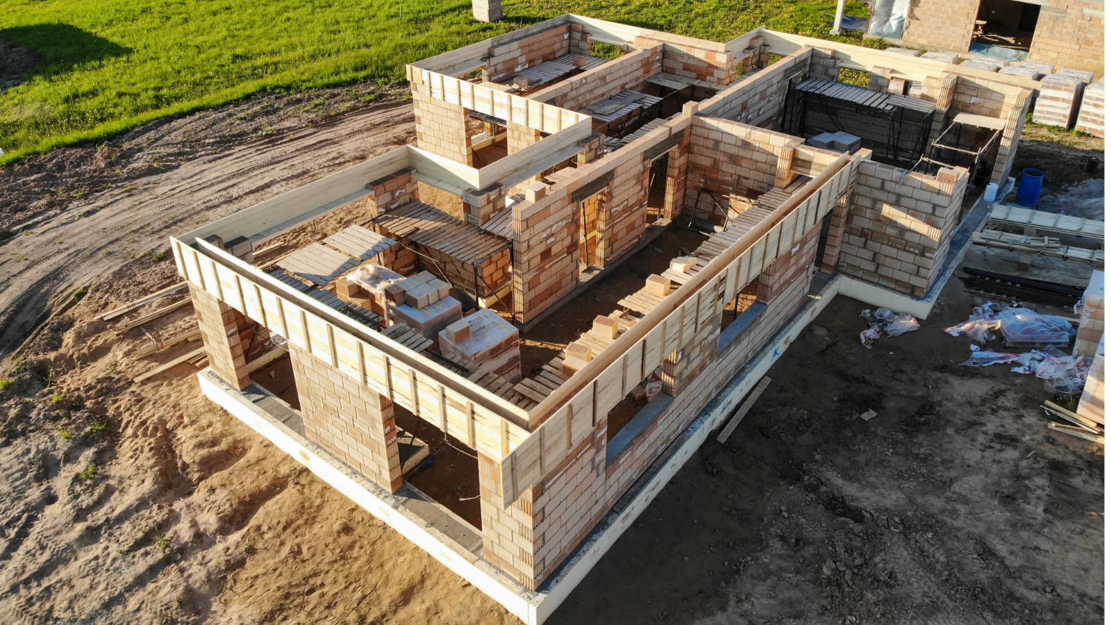
Building construction

5. Housing Starts and Completions

In the residential sector, tracking housing projects commenced, completed, under construction, and in the pipeline, along with the value of these projects, is essential for gauging market health and predicting supply to meet housing needs for the future.

In Australia, the Urban Development Institute of Australia’s latest report shows that the federal government will fall short of its goal to build 1.2 million home by mid-2029. This is due to a “large backlog of properties that have been approved that are yet to be completed” said Westpac chief economist Luci Ellis, who admits there are a lot of factors contributing to this production issue.

6. Architectural Billings Index – United States of America (USA)

Produced by the AIA Economics & Market Research Group, the Architectural Billings Index (ABI) is a leading economic indicator in the USA that reflects the demand for non-residential construction, including commercial and industrial structures. The ABI gauges whether billing activity for the previous month grew, declined, or remained flat. This measure forecasts construction spending by reflecting the lead time between architectural billings and construction expenditure. A positive ABI can be a sign of strength or resurgence in the broader economy, while a negative ABI can signal weakness or an impending downturn.

7. Construction Backlog Indicator – USA

In 2008, the Associated Builders and Contractors introduced the Construction Backlog Indicator (CBI) to forecast the volume of upcoming work for commercial and industrial contractors. This indicator centres on the commercial, institutional, industrial, and infrastructure construction sectors in the USA.

Backlog, as defined by ABC, represents “the dollar value of contracted work to be completed in the future” by construction firms.

To calculate backlog, the formula is:

(Current month’s backlog value in dollars) / Fiscal year revenues (base year) x 12 = Total months of contracted work ahead

CBI provides a view of the volume of construction work in the USA contracted but not yet executed which can serve as a predictor of future activity and industry momentum.

A higher backlog generally implies a more optimistic outlook for the construction industry, while a lower backlog suggests the opposite.

8. Employment in Construction

Job numbers in the construction sector can reveal much about the industry’s health and future growth prospects, including an indicator of any labour shortages, and construction activity and economic impacts.

9. Cordell Construction Cost Index (CCCI)

The Cordell Construction Cost Index (CCCI) is a quarterly industry benchmark that tracks and monitors the movement of building work costs for stand-alone houses. It is a valuable metric which tracks changes in construction costs, including labour costs, services, building material prices, regulatory expenses, equipment and includes expert commentary on key market factors. It is vital for understanding market dynamics, pricing trends and industry comparisons.

10. Equipment Usage

The usage rates of various types of equipment and their deployment in residential, commercial, and industrial segments can offer insights into ongoing industry activity. This data can unveil changes and trends in equipment types, across global regions, segments, and provide an indicator of market share, growth and overall size of the market.

Demolition

11. Construction Productivity

Construction productivity is often measured as output per labour hour. Or in other words, how much work is done during time spent doing it.

Productivity metrics indicate efficiency levels and the there are a number of factors which can impact productivity such as labour characteristics, work condition and non-productive activities, as documented in a Carnegie Mellon University study.

Improving productivity is often in the best interests of stakeholders such as project managers, construction firms, engineers, architects, investors and financiers, regulatory bodies and government agencies, environmental groups and the general public.

Productivity in the construction sector is an important measurement to track as it can impact the ability to deliver outcomes such as housing and infrastructure a country needs to accommodate population changes, the new energy assets required to meet requirements or even a country’s decarbonisation goals.

Construction workplace safety

12. Safety Metrics

All workers have the right to a healthy and safe working environment.

Statistics on work-related injuries, incidents, accidents, fatalities, and safety violations are crucial for assessing the industry’s commitment to safe construction practices and the proposal and implementation of new measures to protect both workers and bystanders.

13. Sustainability and Green Building Metrics

These metrics evaluate a project’s environmental impact and adherence to sustainability principles, both increasingly important in modern construction.

With more and more organisations investing in corporate sustainability and building sustainability strategies and goals, these metrics are important to measure and increase transparency around planning, design and development practices.

The Proptech Cloud’s Environment and Energy Efficiency data contains energy supply data and NABERS energy rating data which may help guide decisions on energy sourcing as part of a sustainability strategy.

14. Supply Chain Metrics

Measuring and analysing the efficiency of the supply chain, including the availability and cost of materials, procurement, processing and distribution of goods helps to anticipate potential construction project impacts such as delays or cost overruns.

Improvements in mathematical models, data infrastructure and the expansion and availability of applications provide deeper insights, while improving forecasting, efficiency and responsiveness in supply chain management.

What Do These Metrics Tell Us

Understanding these diverse metrics is essential for anyone involved in analysing the construction industry as they provide a comprehensive view of the sector’s performance, trends, and economic impact.

Analysts will often use a combination of these metrics and measurements to make conclusions, predictions or decisions regarding the property market.

And by keeping a close eye on these indicators over time, industry professionals can make better decisions, improve market condition forecasts, and more accurately assess the overall health and vitality of the construction sector.


Australian Construction Activity Data

The Proptech Cloud’s Construction Activity dataset contains Australian construction activity statistics which may be helpful for planning, demand forecasting and construction cycle timing.

Subscribe to our newsletter

Subscribe to receive the latest blogs and data listings direct to your inbox.
Read more blogs from The Proptech Cloud

Crafting a Storm Surge and Hurricane Risk Rating for Coastal Properties

A high-level approach to developing a storm surge and hurricane risk rating system to guide stakeholders with a vested interest in coastal properties.

How Proptech Is Revolutionising Real Estate

Proptech is the dynamic intersection of property and technology, and it’s reshaping real estate. And there’s still a huge potential for growth.

What is the Australian Statistical Geography Standard (ASGS)?

The ASGS is used to better understand where people live and how communities are formed.

How to Incorporate Mesh Blocks into Datasets

Mesh blocks can enhance the precision and relevance of geospatial and proptech analyses. Here are some tips and steps to incorporate mesh blocks into datasets.

Australia’s Migration Trends: Where Are People Moving To?

This detailed visual analysis for Australia’s major capital cities breaks down how net migration trends are evolving across different regions.

Understanding Housing Affordability: Key Metrics and Statistics

Understanding Housing Affordability: Key Metrics and Statistics

Housing affordability is a significant concern in many parts of the world, affecting the quality of life and economic wellbeing of individuals and families.

Professor Nicole Gurran from the School of Architecture, Design and Planning says governments around the world are searching for solutions to fix housing affordability, with two opposing schools of thought seeing the solutions as:

  1. Increasing supply. Those in support of this point of view see housing as more expensive because there’s not enough new supply. They see land use regulation and planning processes as restrictive to new construction, adding costly delays and uncertainty to the development process.
  2. On the flipside, others argue that ‘demand side’ factors underlying global house price inflation, such as low cost credit under financial deregulation, or government incentives to encourage property investment are being ignored. They highlight the political influence of property industry groups sustaining housing demand while advocating for reduced regulations. Some even suggest that extensive rezoning reforms may trigger surges in redevelopment and gentrification, potentially displacing individuals with lower incomes.

To truly understand the dynamics of housing affordability we need to take a detailed look at a range of different metrics and statistics to gain a full picture.

Shedding light on these crucial measures can offer insights for homebuyers, policymakers, real estate professionals, and urban planners.

1. Median and Average Home Prices

These figures provide a baseline for understanding the cost of purchasing a home in a particular area, with the median providing a middle point and the average presenting an overall trend.

2. Price-to-Income Ratio

This critical ratio compares home prices to average household incomes. A higher ratio suggests that homes are less affordable relative to income.

3. Housing Affordability Measures

A Housing Affordability Index (HAI) assesses whether a typical family can afford the mortgage on a median-priced home, based on their income. An index above 100 indicates greater affordability.

The issue with the HAI is that it primarily focuses on purchase affordability.

The Australian Institute of Health and Welfare (AIHW) broadens what they classify as housing costs in measuring housing affordability.

AIHW defines housing costs as

the sum of rent payments, rate payments (water and general), and housing–related mortgage payments”,

AIHW expresses housing affordability as

“the ratio of housing costs to gross household income”,

While housing stress is typically described as

lower-income households that spend more than 30% of gross income on housing costs“.

The second measure is a more comprehensive approach which considers a range of housing costs, the complexity of housing affordability and its impact on households.

4. Rent-to-Income Ratio

Rent-to-Income Ratio compares a tenant’s monthly rent to their gross monthly income expressed as a ratio. For those in the rental market, this ratio measures how much of a household’s income is spent on rent, with higher values indicating less affordability.

Rental property

5. Mortgage Interest Rates

Interest rates directly affect the cost of borrowing money for home purchases.

An increase in mortgage interest rates typically mean an increase in mortgage repayments, which can negatively impact affordability.

While a reduction in rates typically means reduced mortgage repayments, which may improve affordability.

6. Mortgage Payment as a Percentage of Income

Mortgage payment as a percentage of income is an important measure of affordability by demonstrating the burden of mortgage payments relative to a household’s income.

This percentage is calculated by dividing monthly mortgage repayments by gross monthly wages. 

The recommended figure is 28% of pre-tax income. Or in other words, no more than 28% of gross monthly income should go towards monthly mortgage repayments.

7. Homeownership Rates

Broad changes in homeownership rates can signal shifts in affordability, and the overall health of the housing market. 

To gain an idea of homeownership rates in Australia, AIHW shares a view of Home ownership and housing tenure in Australia.

8. Cost of Living

Several measures are published to calculate and help gauge changes in the cost of living. Changes in cost of living impacts our household purchasing power and has implications for housing demand. 

The main ways we measure cost of living is the Consumer Price Index.

Consumer Price Index (CPI)

According to the Australian Bureau of Statistics, CPI is a measure of the average change over time in the prices paid by households for a fixed basket of goods and services (which is grouped into 11 categories: Food and non-alcoholic beverages, Alcohol and tobacco, Clothing and footwear, Housing, Furnishings, household equipment and services, Health, Transport, Communication, Recreation and culture, Education, and Insurance and financial services).

 It’s important to note that the calculation of CPI does not include the cost of buying established dwellings, nor mortgage repayments. However, it does include rents, the cost of new dwellings (excluding value of land) and major alterations and additions to dwellings. 

Included in CPI

Not included in CPI

  • Rent
  • Cost of new dwellings (excluding value of land)
  • Major alterations and additions to dwellings
  • Rates and charges
  • Utilities
  • The cost of buying established dwellings
  • The cost of purchasing land
  • Mortgage repayments
  • Costs associated with servicing a mortgage
Consumer Price Index

9. Gini Coefficient of Home Prices

The Gini Coefficient statistical measure is typically used as a measure of income inequality, although it can be used to assess inequality in various other contexts, including home values in a real estate market.

A Gini index of 0 represents perfect equality, while an index of 100 implies perfect inequality.

This measure can indicate the inequality in home values within a market, with higher values suggesting greater disparity.

10. Building Permits and Housing Starts

Building permits and housing starts are indicators of building activity and housing supply.  They can signal future market changes which may impact affordability.

11. Vacancy Rates

A vacancy rate is a measure of the percentage of all rental properties that are currently vacant and available for rent.

Fluctuations in vacancy rates can impact rental prices, as elevated rates often correlate with decreased rents, and conversely, lower vacancy rates may lead to higher rental prices.

12. Debt-to-Income Ratio

An individual’s Debt-to-Income Ratio is calculated by taking their total debt and dividing it by their annual income.

This ratio reflects a person’s capacity to afford housing in light of their existing debts.

14. Population Growth and Urbanisation

Rapid population increases or urbanisation can heighten housing demand, affecting affordability.

A Multifaceted View of Housing Affordability

These range of metrics offer a multifaceted and broader view of housing affordability, reflecting the many factors that impact pricing, while implicitly highlighting the complexities of the housing market.

They’re essential for making informed decisions, shaping policies, and understanding market trends.

By keeping a close eye on these indicators, stakeholders can better navigate the challenges and opportunities within the housing sector.

Subscribe to our newsletter

Subscribe to receive the latest blogs and data listings direct to your inbox.
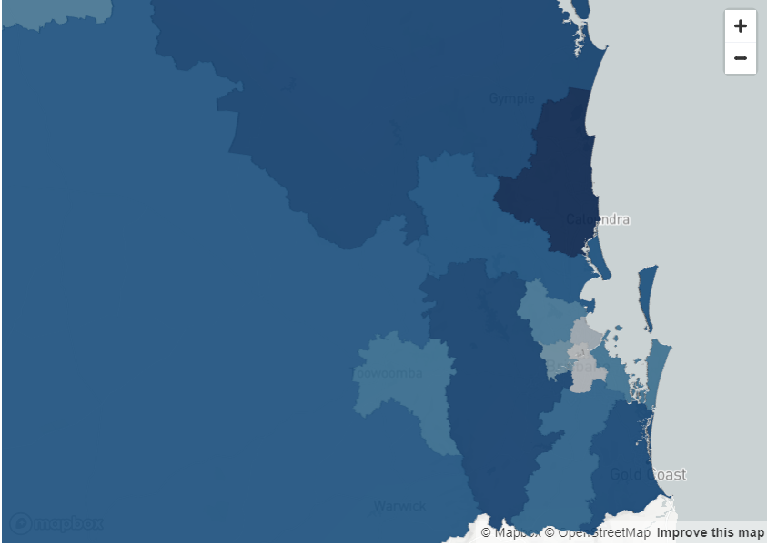
Read more blogs from The Proptech Cloud

Crafting a Storm Surge and Hurricane Risk Rating for Coastal Properties

A high-level approach to developing a storm surge and hurricane risk rating system to guide stakeholders with a vested interest in coastal properties.

How Proptech Is Revolutionising Real Estate

Proptech is the dynamic intersection of property and technology, and it’s reshaping real estate. And there’s still a huge potential for growth.

What is the Australian Statistical Geography Standard (ASGS)?

The ASGS is used to better understand where people live and how communities are formed.

How to Incorporate Mesh Blocks into Datasets

Mesh blocks can enhance the precision and relevance of geospatial and proptech analyses. Here are some tips and steps to incorporate mesh blocks into datasets.

Australia’s Migration Trends: Where Are People Moving To?

This detailed visual analysis for Australia’s major capital cities breaks down how net migration trends are evolving across different regions.