Australia’s Migration Trends: Where Are People Moving To?
Data consultancy, Data Army, delved into the Australia Post Movers Statistics dataset to understand where people are migrating to within Australia and predicting where they’re likely to move to next.
We explain the data visualisations created and documented in our previous blog How to Predict Migration Patterns using Auspost Movers Statistics Data and Snowflake’s Cortex ML functions>
By analysing movements and observing trends, we’re able to gather valuable insights to inspire decisions with data-driven intelligence.
How to Interpret the Data Visualisations
The visualisations below show the net migration metric for all Australian states.
Net migration is calculated by forecasting the number of people moving into an area subtracted by the number of people people moving out of an area.
White, grey and lighter blue colours indicate regions with lower net migration, representing regions where a high number of people are leaving the regions and a lower number of people are relocating into these regions.
Mid to darker blue colours represent regions with higher net migration, regions where the number of people moving to those regions outweigh the number of people leaving those regions.
The Results by State
New South Wales (NSW)
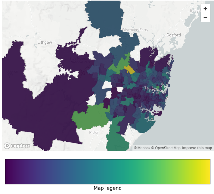
In NSW, prior to the pandemic, the light blue areas in the inner city areas indicate there was some movement in inner city areas including Chatswood, the Sydney Central Business District (CBD) and areas just west of the city.
However, there was a much higher level of migration into the areas much further west of the city including Penrith and Blaxland, as well as Newcastle.
The trend of moving away from the city has further increased since the COVID pandemic in NSW, where areas very close to the city show the lowest forecasted net migration in the state.
This indicates that people are moving away from the city. Some possible explanations for these movements could be due to rising rents or potentially due to the fact that they no longer need to live within metropolitan areas for work.
In NSW, rural areas south of the city close to Canberra such as Goulburn, and rural areas north of Newcastle such as Taree are the regions with the highest amount of forecasted net migration as shown by the visualisations below.
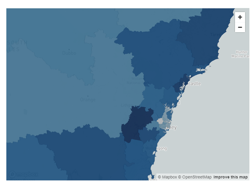
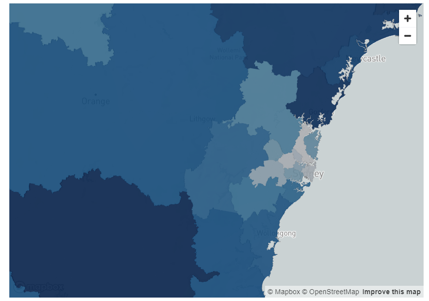
Figure 1: Pre- and post-COVID migration per SA4 for New South Wales
Victoria
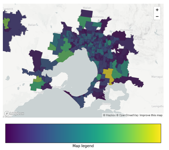
A similar trend can be observed in Victoria. Both pre- and post-pandemic, the areas which had the lowest net migration were the inner city Melbourne suburbs of Brunswick, North Melbourne and Fitzroy.
However, prior to the pandemic, the areas with the highest forecasted net migration was Geelong and the south coast of Melbourne.
Post-COVID, the areas with the highest forecasted migration are even further away, possibly indicating these coastal areas are now also less desirable or unaffordable.
These include rural areas including Warragul and Taree. Greenfield suburbs just north of the city including Sunbury also have high levels of forecasted migration.
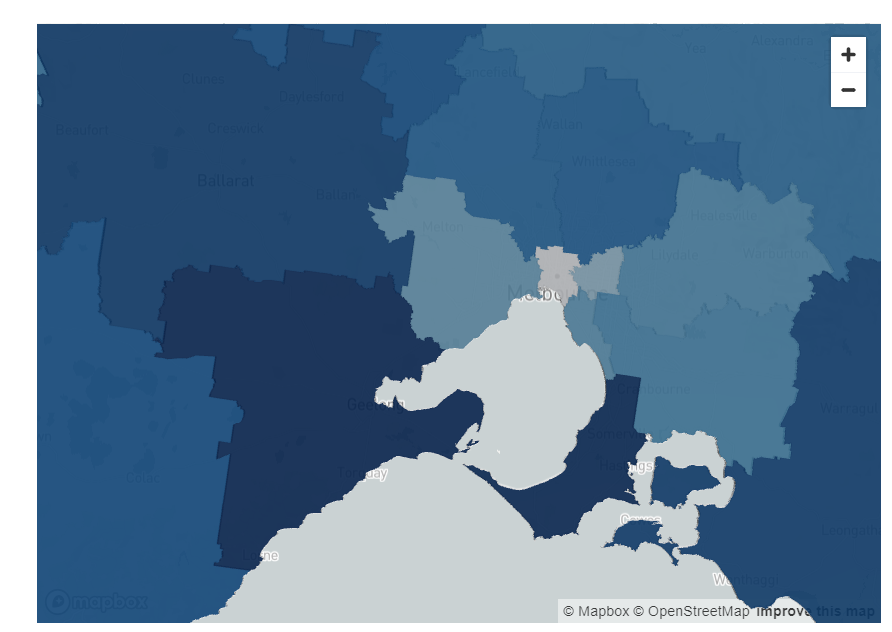
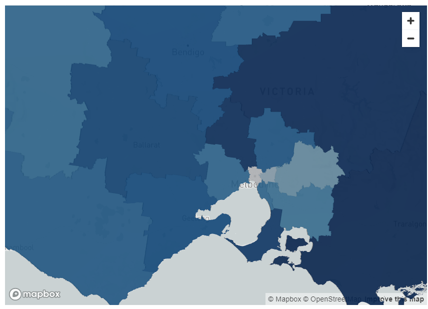
Figure 2: Pre- and post-COVID migration per SA4 for Victoria
Queensland
Like Melbourne, the forecasts for net migration in the inner city part of Brisbane is relatively similar both pre- and post-pandemic.
The inner city areas have low levels of forecasted net migration.
Interestingly, the highest amount of forecasted migration in Queensland prior to the pandemic was in the Gold Coast, which is only approximately an hour from Brisbane CBD.
Post-pandemic, areas further west of the Brisbane city including Ipswich, and Harrisville have higher levels of forecasted migration.
This could be indicative of people from Queensland relocating, but could also suggest people from interstate or overseas moving from other locations to places west of the city.
There is also a high level of migration predicted for the Sunshine Coast post-pandemic, further highlighting the trend also observed in Sydney and Melbourne of people moving into more rural areas.
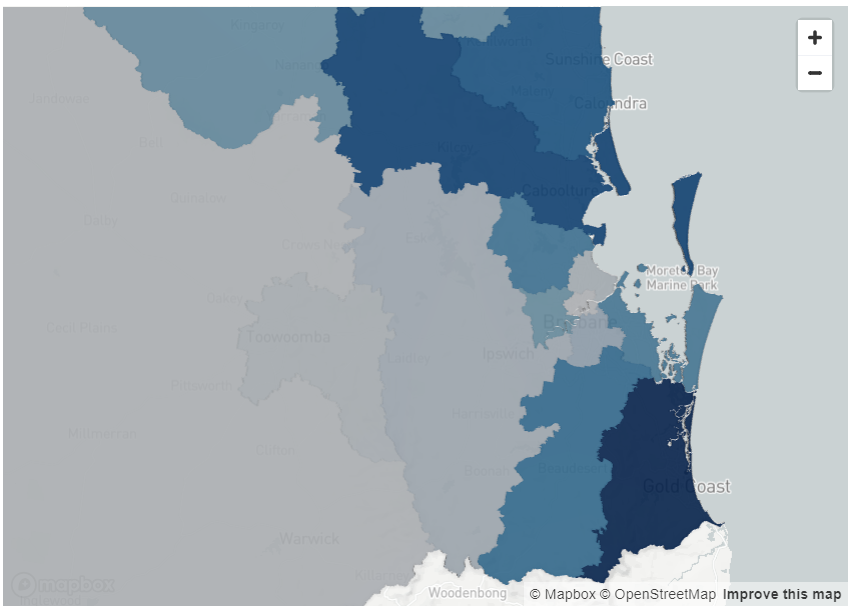
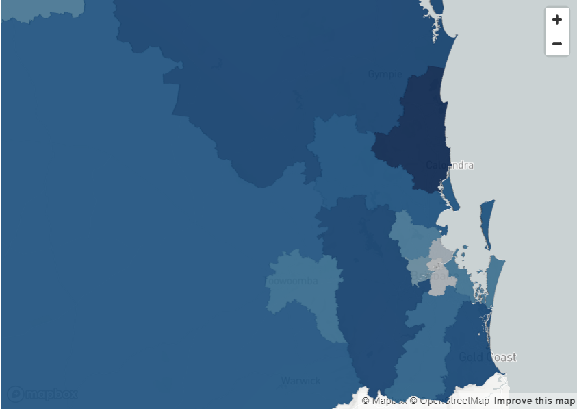
Figure 3: Pre- and post-COVID migration per SA4 for Queensland
South Australia
South Australia, unlike NSW, Victoria and Queensland is one of the few states where the highest forecasted pre-pandemic net migration was in an inner-city area.
However, the trend to relocate to rural areas was very high post-pandemic. Rural areas including Kangaroo Island, Murray Bridge and Clare had much higher forecasted net migration after the pandemic. This supports the trend observed in the other states.
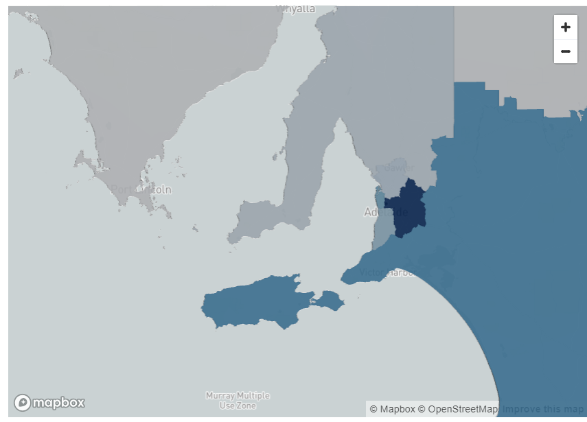
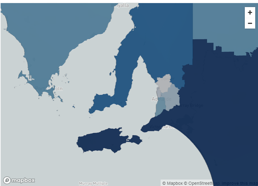
Figure 4: Pre- and post-COVID migration per SA4 for South Australia
Western Australia
Western Australia is one of the few states where the forecasted net migration into rural areas is not high.
The pre-COVID migration forecasts indicate the highest level of net migration were in the Perth City area and post-COVID the highest amount of net migration was just south of the city.
One possible reason for this could be that while Perth house prices and rents have been rising, they are still much lower than Sydney or Melbourne, and therefore is still affordable for people to be able to live close to the city.
Secondly, as mining is the predominant industry in Western Australia, it is possible that it is not feasible for many of these workers to move and work remotely.
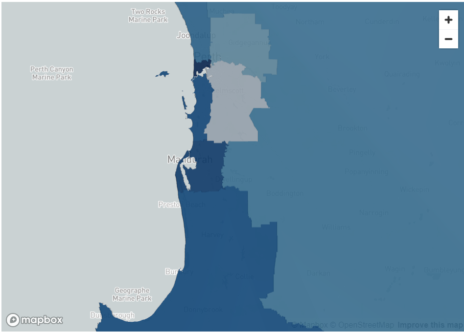
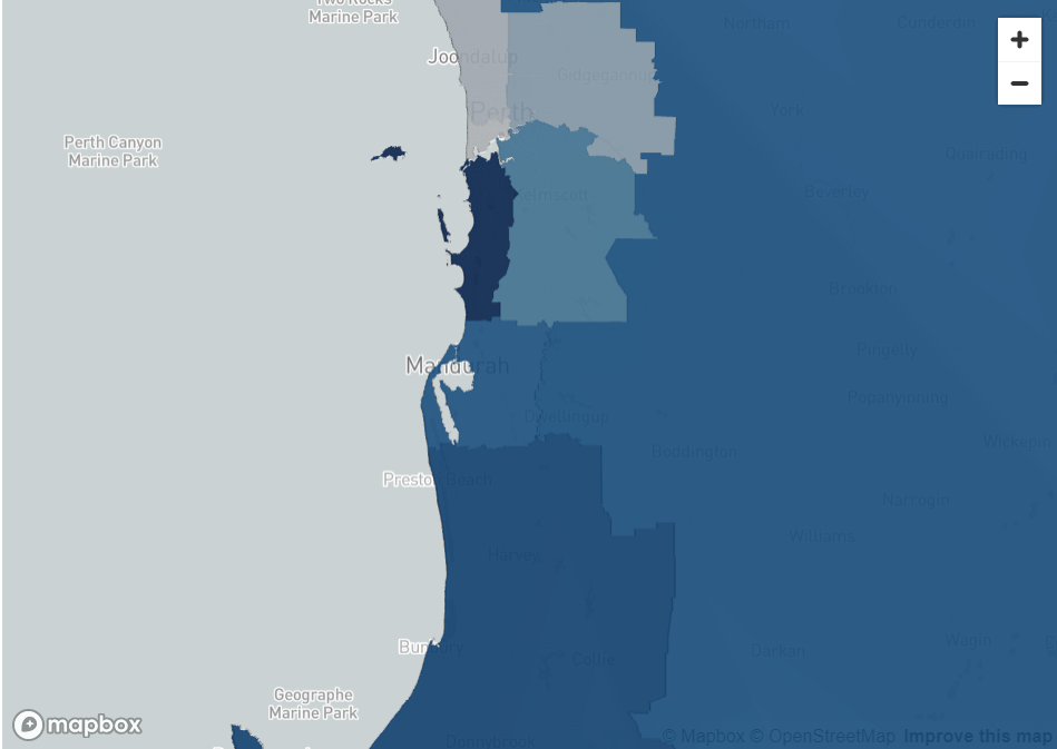
Figure 5: Pre- and post-COVID migration per SA4 for Western Australia
Tasmania
Tasmania is the only Australian state where the amount of net migration into the inner city forecasts are higher post-covid as compared to pre-COVID.
Prior to COVID , Hobart had the lowest net migration compared to all other regions in Tasmania. However, post-COVID the amount of met migration in the CBD is higher, indicating people are moving into Hobart.
Similarly, the amount of forecasted migration into Launceston, Tasmania’s second biggest city, is higher post-COVID as compared to pre-COVID.
The reason that the same rural migration has not been seen in Tasmania, unlike other states, could be because of Tasmania’s population.
Hobart’s population is only approximately 250,000 which is smaller than rural areas that people were migrating to including the Sunshine Coast.
Thus, the high rental and accommodation costs that are evident in highly populated cities, including Sydney or Melbourne may not be evident in Tasmania.
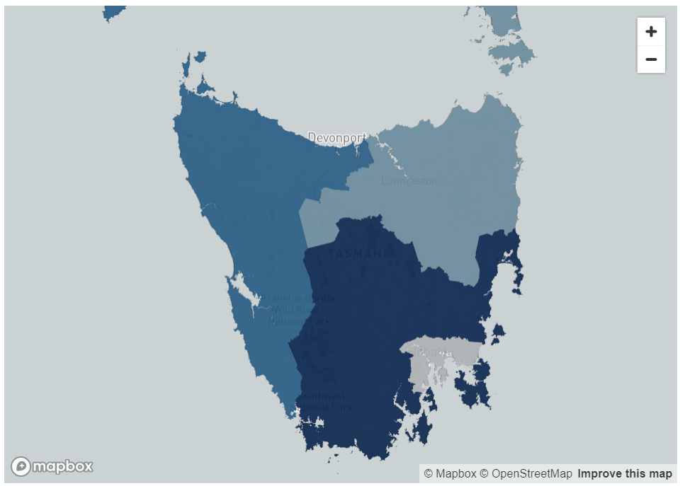
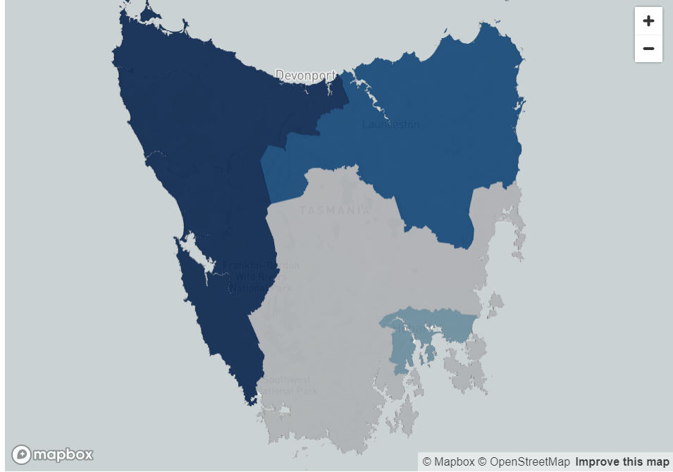
Figure 6: Pre- and post-COVID migration per SA4 for Tasmania
Summary of Findings
In the period post-COVID there is high evidence of people migrating to rural areas, especially in states with larger CBDs such as New South Wales, Victoria and Brisbane.
Interestingly, in these states, people seemed to be migrating to outer-city areas even prior to the pandemic.
This may suggest that there were factors encouraging people to move out of the city. This trend seems to have increased further since COVID.
Overall, there is a clear trend in the two most populated states, New South Wales and Victoria for net migration into rural areas.
These were the two states that were most affected by COVID lockdowns in Australia and have the highest house prices in the country which may be one of the key the drivers behind the high level of relocation to rural areas.
Less populated states including South Australia and Queensland have experienced a similar trend with high levels of net migration to rural areas including Kangaroo Island, Clare and the Sunshine Coast.
The only states that haven’t experienced net migration to rural areas are Western Australia and Tasmania.
A Reflection of Australia’s Housing Situation
Australia is in the midst of a housing crisis where steep house prices prevent many first-home buyers from entering the market, especially in inner-city areas.
Driven by the low supply of rentals and high post-pandemic migration, rents continue to skyrocket in many metropolitan cites.
In Australia’s most populous metropolitan areas Sydney and Melbourne, rents rose by 10.2% and 11.1%1 from December 2022 to December 2023 respectively.
Since 2020, the COVID pandemic has transformed the workplace environment, by forcing some office workers to do their job remotely due to lockdowns and government restrictions.
To this day, some office workers continue to work remotely full or part time, meaning that when picking a place to live, they may not need to prioritise being within a reasonable commuting distance from their usual physical office.
The combination of unaffordable rents and mortgages in inner city areas and increase in work from home trends may have contributed to many Australians migrating to outer-city and rural locations.
Strategic Insights
The findings hold significant strategic value for both the private and public sectors.
Incorporating these insights alongside additional data points, such as overseas migration into Australia, enriches the analysis, providing a more comprehensive understanding of migration patterns.
This broader perspective can enhance strategic planning and decision-making processes across various industries and governmental levels.
Examples include real estate development, investment, business expansion, transportation and infrastructure decisions, as well as urban, land use, policy or even healthcare and public services planning.
These findings can offer a foundation for both private and public sectors to adapt to changing demographic patterns in a way that maximises economic opportunities while ensuring community well-being and sustainability.
About The Analysis
Data Army used the Australian Post Movers Statistics dataset to base the forecasts in migration patterns during and after the COVID pandemic in each Australian state.
The primary dataset used in this study is the Australia Post Movers Statistics. It contains de-identified and aggregated data on moves across Australia based on mail redirection requests from the previous 5 years.
For this exercise, data from February 2019 to January 2024 was used.
Each entry in the data includes
- the postcode the household relocated from,
- the postcode the household relocated to,
- the month of relocation, and
- the number of the people that relocated.
This analysis shows forecasted migrated trends for the next year when pre-pandemic data is used (Feb 2019 – Jan 2020) compared to forecasts based on mail redirection requests in the post-pandemic era (2022-2024).
The analysis was conducted on a Statistical Area Level 4 level which are Australian Bureau of Statistics (ABS) defined regions that clearly distinguish inner-city areas, outer-city areas and rural areas.
Australia Post Movers Statistics Data
This dataset contains five years of de-identified, aggregated information on past moves captured by Australia Post’s Mail Redirection service.
Access Australia Post mail redirect statistics now to help you develop competitive data-driven strategies.
The intellectual property rights for all content in this blog are exclusively held by Data Army and The Proptech Cloud. All rights are reserved, and no content may be republished or reproduced without express written permission from us. All content provided is for informational purposes only. While we strive to ensure that the information provided here is both factual and accurate, we make no representations or warranties of any kind about the completeness, accuracy, reliability, suitability, or availability with respect to the blog or the information, products, services, or related graphics contained on the blog for any purpose.
Subscribe to our newsletter
Subscribe to receive the latest blogs and data listings direct to your inbox.
Data consultancy, Data Army dives into the Australia Post Movers Statistics dataset to understand where people are migrating to within Australia and predicting where they’re likely to move to next.
We explain the data visualisations created and documented in our previous blog How to Predict Migration Patterns using Auspost Movers Statistics Data and Snowflake’s Cortex ML functions>
By analysing movements and observing trends, we’re able to gather valuable insights to inspire decisions with data-driven intelligence.
How to Interpret the Data Visualisations
The visualisations below show the net migration metric for all Australian states.
Net migration is calculated by forecasting the number of people moving into an area subtracted by the number of people people moving out of an area.
White, grey and lighter blue colours indicate regions with lower net migration, representing regions where a high number of people are leaving the regions and a lower number of people are relocating into these regions.
Mid to darker blue colours represent regions with higher net migration, regions where the number of people moving to those regions outweigh the number of people leaving those regions.
The Results by State
New South Wales (NSW)
In NSW, prior to the pandemic, the light blue areas in the inner city areas indicate there was some movement in inner city areas including Chatswood, the Sydney Central Business District (CBD) and areas just west of the city.
However, there was a much higher level of migration into the areas much further west of the city including Penrith and Blaxland, as well as Newcastle.
The trend of moving away from the city has further increased since the COVID pandemic in NSW, where areas very close to the city show the lowest forecasted net migration in the state.
This indicates that people are moving away from the city. Some possible explanations for these movements could be due to rising rents or potentially due to the fact that they no longer need to live within metropolitan areas for work.
In NSW, rural areas south of the city close to Canberra such as Goulburn, and rural areas north of Newcastle such as Taree are the regions with the highest amount of forecasted net migration as shown by the visualisations below.


Figure 1: Pre- and post-COVID migration per SA4 for New South Wales
Victoria
A similar trend can be observed in Victoria. Both pre- and post-pandemic, the areas which had the lowest net migration were the inner city Melbourne suburbs of Brunswick, North Melbourne and Fitzroy.
However, prior to the pandemic, the areas with the highest forecasted net migration was Geelong and the south coast of Melbourne.
Post-COVID, the areas with the highest forecasted migration are even further away, possibly indicating these coastal areas are now also less desirable or unaffordable.
These include rural areas including Warragul and Taree. Greenfield suburbs just north of the city including Sunbury also have high levels of forecasted migration.


Figure 2: Pre- and post-COVID migration per SA4 for Victoria
Queensland
Like Melbourne, the forecasts for net migration in the inner city part of Brisbane is relatively similar both pre- and post-pandemic.
The inner city areas have low levels of forecasted net migration.
Interestingly, the highest amount of forecasted migration in Queensland prior to the pandemic was in the Gold Coast, which is only approximately an hour from Brisbane CBD.
Post-pandemic, areas further west of the Brisbane city including Ipswich, and Harrisville have higher levels of forecasted migration.
This could be indicative of people from Queensland relocating, but could also suggest people from interstate or overseas moving from other locations to places west of the city.
There is also a high level of migration predicted for the Sunshine Coast post-pandemic, further highlighting the trend also observed in Sydney and Melbourne of people moving into more rural areas.


Figure 3: Pre- and post-COVID migration per SA4 for Queensland
South Australia
South Australia, unlike NSW, Victoria and Queensland is one of the few states where the highest forecasted pre-pandemic net migration was in an inner-city area.
However, the trend to relocate to rural areas was very high post-pandemic. Rural areas including Kangaroo Island, Murray Bridge and Clare had much higher forecasted net migration after the pandemic. This supports the trend observed in the other states.


Figure 4: Pre- and post-COVID migration per SA4 for South Australia
Western Australia
Western Australia is one of the few states where the forecasted net migration into rural areas is not high.
The pre-COVID migration forecasts indicate the highest level of net migration were in the Perth City area and post-COVID the highest amount of net migration was just south of the city.
One possible reason for this could be that while Perth house prices and rents have been rising, they are still much lower than Sydney or Melbourne, and therefore is still affordable for people to be able to live close to the city.
Secondly, as mining is the predominant industry in Western Australia, it is possible that it is not feasible for many of these workers to move and work remotely.


Figure 5: Pre- and post-COVID migration per SA4 for Western Australia
Tasmania
Tasmania is the only Australian state where the amount of net migration into the inner city forecasts are higher post-covid as compared to pre-COVID.
Prior to COVID , Hobart had the lowest net migration compared to all other regions in Tasmania. However, post-COVID the amount of met migration in the CBD is higher, indicating people are moving into Hobart.
Similarly, the amount of forecasted migration into Launceston, Tasmania’s second biggest city, is higher post-COVID as compared to pre-COVID.
The reason that the same rural migration has not been seen in Tasmania, unlike other states, could be because of Tasmania’s population.
Hobart’s population is only approximately 250,000 which is smaller than rural areas that people were migrating to including the Sunshine Coast.
Thus, the high rental and accommodation costs that are evident in highly populated cities, including Sydney or Melbourne may not be evident in Tasmania.


Figure 6: Pre- and post-COVID migration per SA4 for Tasmania
Summary of Findings
In the period post-COVID there is high evidence of people migrating to rural areas, especially in states with larger CBDs such as New South Wales, Victoria and Brisbane.
Interestingly, in these states, people seemed to be migrating to outer-city areas even prior to the pandemic.
This may suggest that there were factors encouraging people to move out of the city. This trend seems to have increased further since COVID.
Overall, there is a clear trend in the two most populated states, New South Wales and Victoria for net migration into rural areas.
These were the two states that were most affected by COVID lockdowns in Australia and have the highest house prices in the country which may be one of the key the drivers behind the high level of relocation to rural areas.
Less populated states including South Australia and Queensland have experienced a similar trend with high levels of net migration to rural areas including Kangaroo Island, Clare and the Sunshine Coast.
The only states that haven’t experienced net migration to rural areas are Western Australia and Tasmania.
A Reflection of Australia’s Housing Situation
Australia is in the midst of a housing crisis where steep house prices prevent many first-home buyers from entering the market, especially in inner-city areas.
Driven by the low supply of rentals and high post-pandemic migration, rents continue to skyrocket in many metropolitan cites.
In Australia’s most populous metropolitan areas Sydney and Melbourne, rents rose by 10.2% and 11.1%1 from December 2022 to December 2023 respectively.
Since 2020, the COVID pandemic has transformed the workplace environment, by forcing some office workers to do their job remotely due to lockdowns and government restrictions.
To this day, some office workers continue to work remotely full or part time, meaning that when picking a place to live, they may not need to prioritise being within a reasonable commuting distance from their usual physical office.
The combination of unaffordable rents and mortgages in inner city areas and increase in work from home trends may have contributed to many Australians migrating to outer-city and rural locations.
Strategic Insights
The findings hold significant strategic value for both the private and public sectors.
Incorporating these insights alongside additional data points, such as overseas migration into Australia, enriches the analysis, providing a more comprehensive understanding of migration patterns.
This broader perspective can enhance strategic planning and decision-making processes across various industries and governmental levels.
Examples include real estate development, investment, business expansion, transportation and infrastructure decisions, as well as urban, land use, policy or even healthcare and public services planning.
These findings can offer a foundation for both private and public sectors to adapt to changing demographic patterns in a way that maximises economic opportunities while ensuring community well-being and sustainability.
About The Analysis
Data Army used the Australian Post Movers Statistics dataset to base the forecasts in migration patterns during and after the COVID pandemic in each Australian state.
The primary dataset used in this study is the Australia Post Movers Statistics. It contains de-identified and aggregated data on moves across Australia based on mail redirection requests from the previous 5 years.
For this exercise, data from February 2019 to January 2024 was used.
Each entry in the data includes
- the postcode the household relocated from,
- the postcode the household relocated to,
- the month of relocation, and
- the number of the people that relocated.
This analysis shows forecasted migrated trends for the next year when pre-pandemic data is used (Feb 2019 – Jan 2020) compared to forecasts based on mail redirection requests in the post-pandemic era (2022-2024).
The analysis was conducted on a Statistical Area Level 4 level which are Australian Bureau of Statistics (ABS) defined regions that clearly distinguish inner-city areas, outer-city areas and rural areas.
Australia Post Movers Statistics Data
This dataset contains five years of de-identified, aggregated information on past moves captured by Australia Post’s Mail Redirection service.
Access Australia Post mail redirect statistics now to help you develop competitive data-driven strategies.
The intellectual property rights for all content in this blog are exclusively held by Data Army and The Proptech Cloud. All rights are reserved, and no content may be republished or reproduced without express written permission from us. All content provided is for informational purposes only. While we strive to ensure that the information provided here is both factual and accurate, we make no representations or warranties of any kind about the completeness, accuracy, reliability, suitability, or availability with respect to the blog or the information, products, services, or related graphics contained on the blog for any purpose.
Subscribe to our newsletter
Subscribe to receive the latest blogs and data listings direct to your inbox.
Data consultancy, Data Army dives into the Australia Post Movers Statistics dataset to understand where people are migrating to within Australia and predicting where they’re likely to move to next.
We explain the data visualisations created and documented in our previous blog How to Predict Migration Patterns using Auspost Movers Statistics Data and Snowflake’s Cortex ML functions>
By analysing movements and observing trends, we’re able to gather valuable insights to inspire decisions with data-driven intelligence.
How to Interpret the Data Visualisations
The visualisations below show the net migration metric for all Australian states.
Net migration is calculated by forecasting the number of people moving into an area subtracted by the number of people people moving out of an area.
White, grey and lighter blue colours indicate regions with lower net migration, representing regions where a high number of people are leaving the regions and a lower number of people are relocating into these regions.
Mid to darker blue colours represent regions with higher net migration, regions where the number of people moving to those regions outweigh the number of people leaving those regions.
The Results by State
New South Wales (NSW)
In NSW, prior to the pandemic, the light blue areas in the inner city areas indicate there was some movement in inner city areas including Chatswood, the Sydney Central Business District (CBD) and areas just west of the city.
However, there was a much higher level of migration into the areas much further west of the city including Penrith and Blaxland, as well as Newcastle.
The trend of moving away from the city has further increased since the COVID pandemic in NSW, where areas very close to the city show the lowest forecasted net migration in the state.
This indicates that people are moving away from the city. Some possible explanations for these movements could be due to rising rents or potentially due to the fact that they no longer need to live within metropolitan areas for work.
In NSW, rural areas south of the city close to Canberra such as Goulburn, and rural areas north of Newcastle such as Taree are the regions with the highest amount of forecasted net migration as shown by the visualisations below.


Figure 1: Pre- and post-COVID migration per SA4 for New South Wales
Victoria
A similar trend can be observed in Victoria. Both pre- and post-pandemic, the areas which had the lowest net migration were the inner city Melbourne suburbs of Brunswick, North Melbourne and Fitzroy.
However, prior to the pandemic, the areas with the highest forecasted net migration was Geelong and the south coast of Melbourne.
Post-COVID, the areas with the highest forecasted migration are even further away, possibly indicating these coastal areas are now also less desirable or unaffordable.
These include rural areas including Warragul and Taree. Greenfield suburbs just north of the city including Sunbury also have high levels of forecasted migration.


Figure 2: Pre- and post-COVID migration per SA4 for Victoria
Queensland
Like Melbourne, the forecasts for net migration in the inner city part of Brisbane is relatively similar both pre- and post-pandemic.
The inner city areas have low levels of forecasted net migration.
Interestingly, the highest amount of forecasted migration in Queensland prior to the pandemic was in the Gold Coast, which is only approximately an hour from Brisbane CBD.
Post-pandemic, areas further west of the Brisbane city including Ipswich, and Harrisville have higher levels of forecasted migration.
This could be indicative of people from Queensland relocating, but could also suggest people from interstate or overseas moving from other locations to places west of the city.
There is also a high level of migration predicted for the Sunshine Coast post-pandemic, further highlighting the trend also observed in Sydney and Melbourne of people moving into more rural areas.


Figure 3: Pre- and post-COVID migration per SA4 for Queensland
South Australia
South Australia, unlike NSW, Victoria and Queensland is one of the few states where the highest forecasted pre-pandemic net migration was in an inner-city area.
However, the trend to relocate to rural areas was very high post-pandemic. Rural areas including Kangaroo Island, Murray Bridge and Clare had much higher forecasted net migration after the pandemic. This supports the trend observed in the other states.


Figure 4: Pre- and post-COVID migration per SA4 for South Australia
Western Australia
Western Australia is one of the few states where the forecasted net migration into rural areas is not high.
The pre-COVID migration forecasts indicate the highest level of net migration were in the Perth City area and post-COVID the highest amount of net migration was just south of the city.
One possible reason for this could be that while Perth house prices and rents have been rising, they are still much lower than Sydney or Melbourne, and therefore is still affordable for people to be able to live close to the city.
Secondly, as mining is the predominant industry in Western Australia, it is possible that it is not feasible for many of these workers to move and work remotely.


Figure 5: Pre- and post-COVID migration per SA4 for Western Australia
Tasmania
Tasmania is the only Australian state where the amount of net migration into the inner city forecasts are higher post-covid as compared to pre-COVID.
Prior to COVID , Hobart had the lowest net migration compared to all other regions in Tasmania. However, post-COVID the amount of met migration in the CBD is higher, indicating people are moving into Hobart.
Similarly, the amount of forecasted migration into Launceston, Tasmania’s second biggest city, is higher post-COVID as compared to pre-COVID.
The reason that the same rural migration has not been seen in Tasmania, unlike other states, could be because of Tasmania’s population.
Hobart’s population is only approximately 250,000 which is smaller than rural areas that people were migrating to including the Sunshine Coast.
Thus, the high rental and accommodation costs that are evident in highly populated cities, including Sydney or Melbourne may not be evident in Tasmania.


Figure 6: Pre- and post-COVID migration per SA4 for Tasmania
Summary of Findings
In the period post-COVID there is high evidence of people migrating to rural areas, especially in states with larger CBDs such as New South Wales, Victoria and Brisbane.
Interestingly, in these states, people seemed to be migrating to outer-city areas even prior to the pandemic.
This may suggest that there were factors encouraging people to move out of the city. This trend seems to have increased further since COVID.
Overall, there is a clear trend in the two most populated states, New South Wales and Victoria for net migration into rural areas.
These were the two states that were most affected by COVID lockdowns in Australia and have the highest house prices in the country which may be one of the key the drivers behind the high level of relocation to rural areas.
Less populated states including South Australia and Queensland have experienced a similar trend with high levels of net migration to rural areas including Kangaroo Island, Clare and the Sunshine Coast.
The only states that haven’t experienced net migration to rural areas are Western Australia and Tasmania.
A Reflection of Australia’s Housing Situation
Australia is in the midst of a housing crisis where steep house prices prevent many first-home buyers from entering the market, especially in inner-city areas.
Driven by the low supply of rentals and high post-pandemic migration, rents continue to skyrocket in many metropolitan cites.
In Australia’s most populous metropolitan areas Sydney and Melbourne, rents rose by 10.2% and 11.1%1 from December 2022 to December 2023 respectively.
Since 2020, the COVID pandemic has transformed the workplace environment, by forcing some office workers to do their job remotely due to lockdowns and government restrictions.
To this day, some office workers continue to work remotely full or part time, meaning that when picking a place to live, they may not need to prioritise being within a reasonable commuting distance from their usual physical office.
The combination of unaffordable rents and mortgages in inner city areas and increase in work from home trends may have contributed to many Australians migrating to outer-city and rural locations.
Strategic Insights
The findings hold significant strategic value for both the private and public sectors.
Incorporating these insights alongside additional data points, such as overseas migration into Australia, enriches the analysis, providing a more comprehensive understanding of migration patterns.
This broader perspective can enhance strategic planning and decision-making processes across various industries and governmental levels.
Examples include real estate development, investment, business expansion, transportation and infrastructure decisions, as well as urban, land use, policy or even healthcare and public services planning.
These findings can offer a foundation for both private and public sectors to adapt to changing demographic patterns in a way that maximises economic opportunities while ensuring community well-being and sustainability.
About The Analysis
Data Army used the Australian Post Movers Statistics dataset to base the forecasts in migration patterns during and after the COVID pandemic in each Australian state.
The primary dataset used in this study is the Australia Post Movers Statistics. It contains de-identified and aggregated data on moves across Australia based on mail redirection requests from the previous 5 years.
For this exercise, data from February 2019 to January 2024 was used.
Each entry in the data includes
- the postcode the household relocated from,
- the postcode the household relocated to,
- the month of relocation, and
- the number of the people that relocated.
This analysis shows forecasted migrated trends for the next year when pre-pandemic data is used (Feb 2019 – Jan 2020) compared to forecasts based on mail redirection requests in the post-pandemic era (2022-2024).
The analysis was conducted on a Statistical Area Level 4 level which are Australian Bureau of Statistics (ABS) defined regions that clearly distinguish inner-city areas, outer-city areas and rural areas.
Australia Post Movers Statistics Data
This dataset contains five years of de-identified, aggregated information on past moves captured by Australia Post’s Mail Redirection service.
Access Australia Post mail redirect statistics now to help you develop competitive data-driven strategies.
The intellectual property rights for all content in this blog are exclusively held by Data Army and The Proptech Cloud. All rights are reserved, and no content may be republished or reproduced without express written permission from us. All content provided is for informational purposes only. While we strive to ensure that the information provided here is both factual and accurate, we make no representations or warranties of any kind about the completeness, accuracy, reliability, suitability, or availability with respect to the blog or the information, products, services, or related graphics contained on the blog for any purpose.
Subscribe to our newsletter
Subscribe to receive the latest blogs and data listings direct to your inbox.


